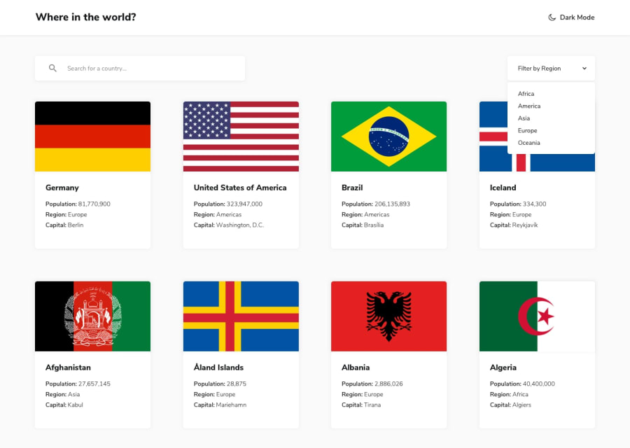
Fully responsive and accessible project built using Angular 18
Design comparison
Solution retrospective
This was one of my first websites built using Angular, as I have a lot of experience building websites with React. The biggest challenge was learning the quirks of Angular and how some things worked differently. I overcame this by reading documentation, watching tutorials when needed, and using what knowledge of react I did have to solve problems. I built this in about 3 days, and probably about 5-6 hours in total.
Community feedback
- @TedJenklerPosted 3 months ago
Hi Declan,
I see that you’ve used a custom select component—nice touch! Here are a few suggestions to enhance it further:
Remove the black border around the select component to give it a cleaner look. Add a transform with rotate(180deg) to the arrow image for a smooth animation when the select is opened.
Hover effects on the select options would also enhance the user experience.
I noticed you creatively added time zones instead of border countries. As an extra challenge, consider including both—this would give you more practice with Angular's routing and make your project even more unique.
Overall, it’s a nice project, but fine-tuning the card design a bit more could elevate it into an excellent portfolio piece.
Hope this feedback was helpful!
Best, Teodor
Marked as helpful1
Please log in to post a comment
Log in with GitHubJoin our Discord community
Join thousands of Frontend Mentor community members taking the challenges, sharing resources, helping each other, and chatting about all things front-end!
Join our Discord

