Fully Animated and Responsive Bookmark Landing Page with Malachite UI!
Design comparison
Solution retrospective
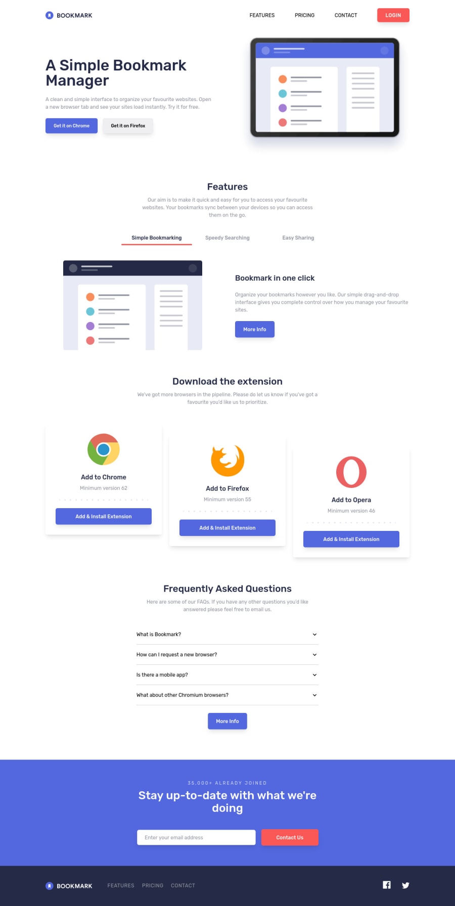
What's up folks! Another fun project, although It took a substantial amount of time, but it was straightforward to code using Svelte, WindiCSS and Malachite UI, my own component library. I used the Accordion, Popover and Tabs component, so all I had to do was install, import, add markup, style, add transitions and chill all day.
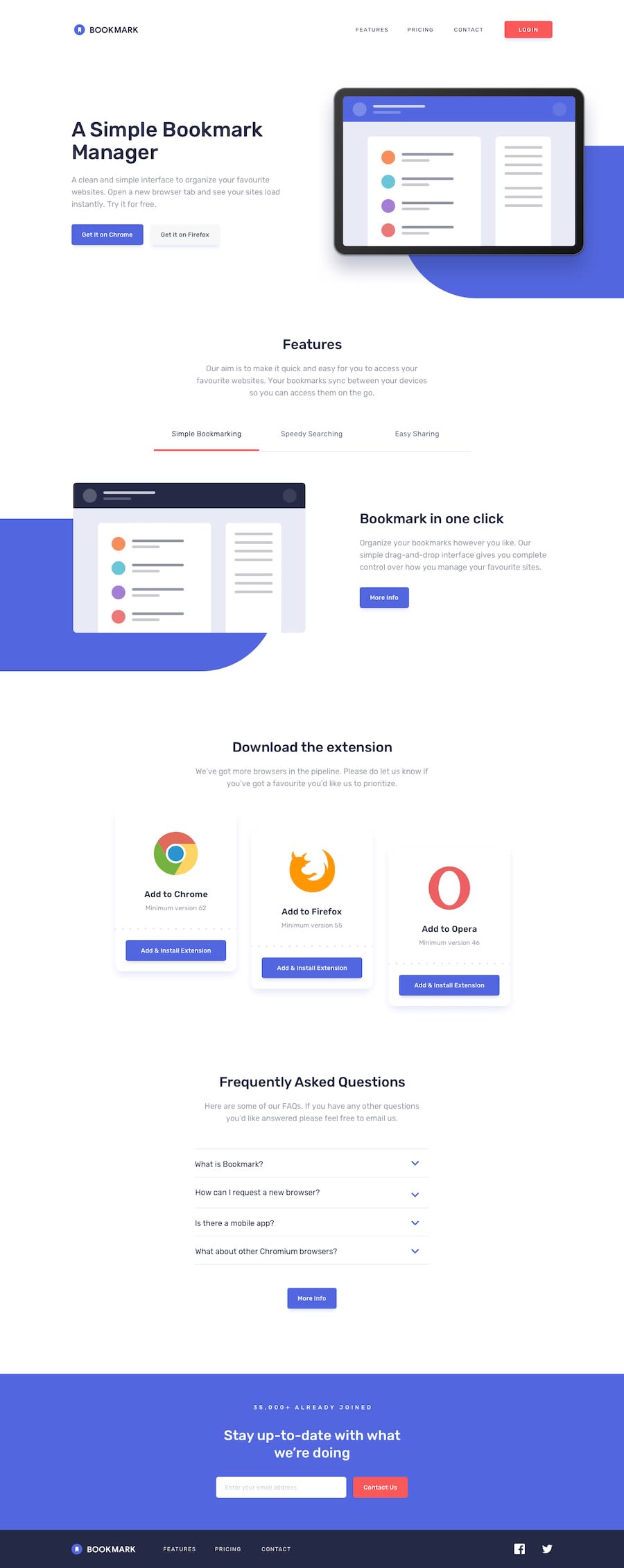
The blue blobs behind the illustrations didn't make it. I tried to add them but it was at the end when everything was all done, I would have had to do breaking changes to the overall layout of the page which was a price I was not willing to pay, at least not for now xD. How did you guys handled those blob things?
Thanks for viewing/replying. Hope you all are doing great and have a good day!
Community feedback
Please log in to post a comment
Log in with GitHubJoin our Discord community
Join thousands of Frontend Mentor community members taking the challenges, sharing resources, helping each other, and chatting about all things front-end!
Join our Discord
