Fullstack Url shortener with solid JS + Fastify(Express) + mongoDB
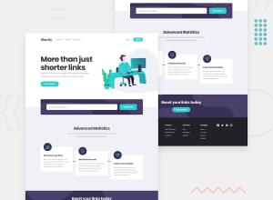
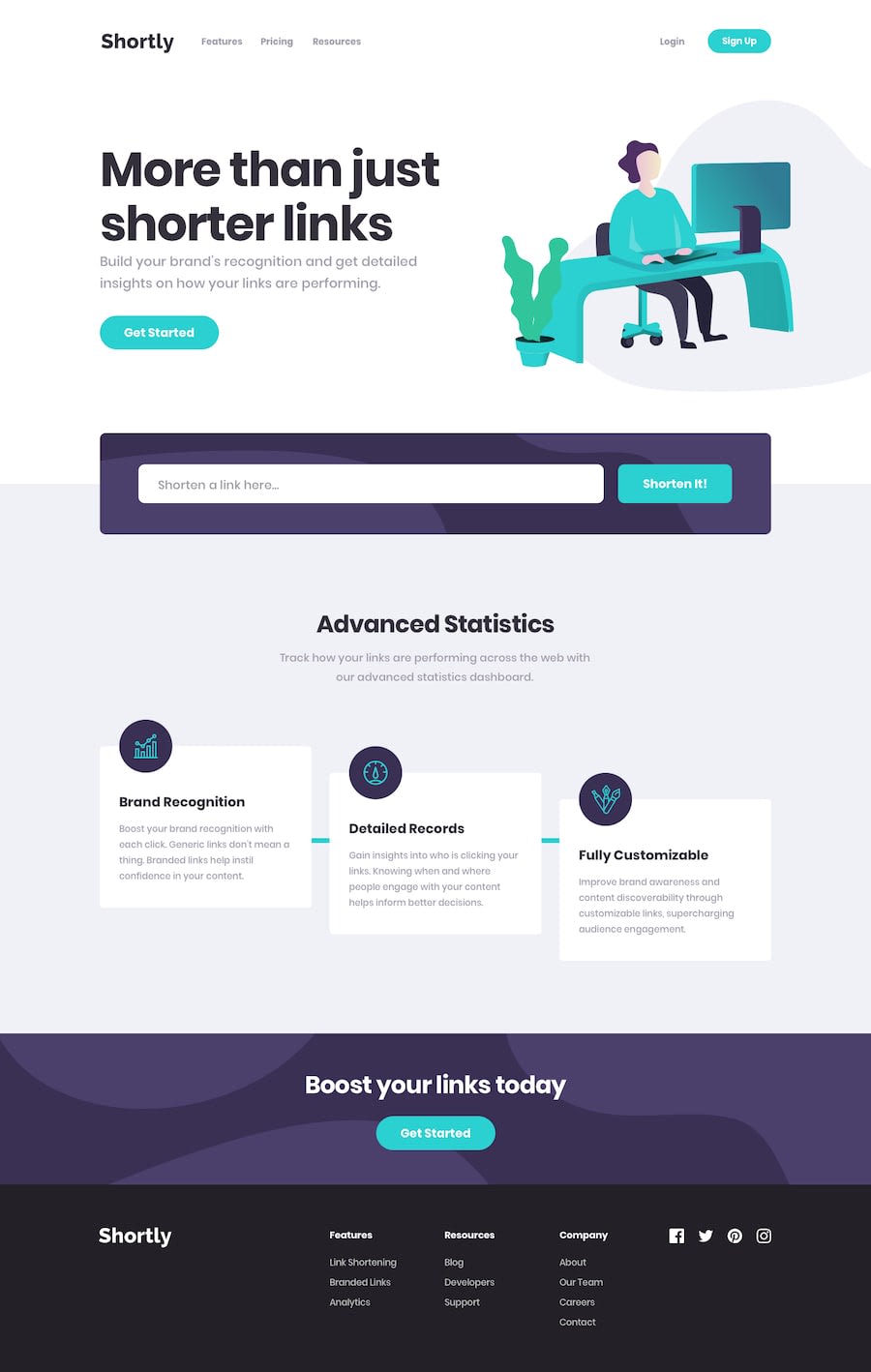
Design comparison
Solution retrospective
I challenged myself to build the backend for the URL shortener using a lightweight express js framework. The backend repo also uses background job scheduling using Agenda this is because by using Prisma there is no way to add time series collections to your MongoDB database. So by using collections, it would take a long to update each record --updating the count of click -- once the user redirects.
Surprisingly, the front end was harder than I expected, this is my second solid js application and I struggled with saving the results to localStorage as well as reactivity concepts. The styling was at most challenging in the CTA section and statistics cards. What was challenging in CTA was having the background color at the same time with the background images; keeping in mind that the background color would be a mix blend mode color which I couldn't get right.
<div>
   <Toaster />
   <div
    id="header-container"
    style={{width: "min(80%, 1440px)", margin: "0 auto"}}
   >
    <Navbar />
    <Hero />
   </div>
   <main class="bg-very-light-gray">
    <div
     id="main-container"
     class="flex flex-col items-center pb-[20vmin]"
     style={{width: "min(80%, 1440px)", margin: "0 auto"}}
    >
     <FormSection />
     <StatisticsCard />
    </div>
   </main>
   <section id="cta-section" class="">
    <div id="cta-wrapper" class="bg-[#3b3054f0]">
     <div
      id="cta-container"
      style={{width: "min(80%, 1440px)", margin: "0 auto"}}
     >
      <CTA />
     </div>
    </div>
   </section>
   <footer class="bg-very-dark-violet">
    <div
     id="footer-container"
     class="flex flex-col items-center"
     style={{width: "min(80%, 1440px)", margin: "0 auto"}}
    >
     <Footer />
    </div>
   </footer>
  </div>
In the Statistics cards styling the horizontal lines led me to using some styling hacks as seen below
#card-1::before {
  content: "-";
  position: absolute;
  font-size: 10px;
  top: 30%;
  left: -5rem;
  width: 5rem;
  height: 12px;
  @apply bg-cyan text-cyan;
}

#card-2::before {
  content: "-";
  position: absolute;
  font-size: 10px;
  top: 10%;
  left: -5rem;
  width: 5rem;
  height: 12px;
  @apply bg-cyan text-cyan;
}
Any feedback on how I would have gone about differently on the styling would be supportive.
Community feedback
Please log in to post a comment
Log in with GitHubJoin our Discord community
Join thousands of Frontend Mentor community members taking the challenges, sharing resources, helping each other, and chatting about all things front-end!
Join our Discord
