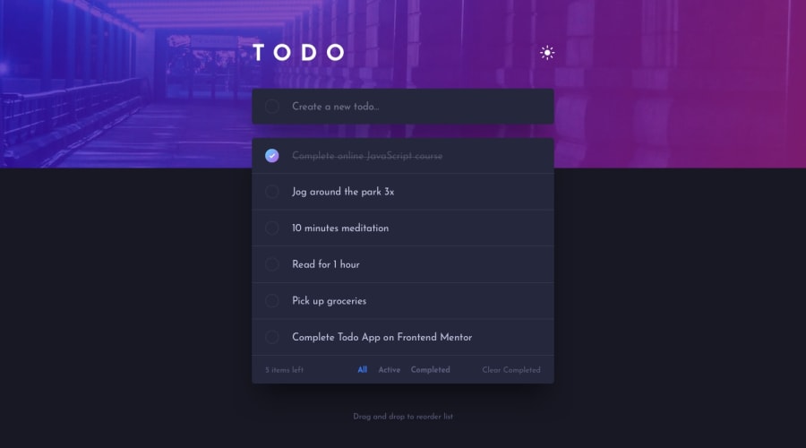
Design comparison
Solution retrospective
This challenge has made me step outside my comfort zone to try new technologies such as Next Js, Firebase, and Tailwind CSS. I struggled implementing my very first dark mode with Next JS. And it made me want to smash my computer.
But in the end, I am glad I decided to challenge myself by using these new technologies to create this application. The process of learning each technology and then trying to combine them together to create something beautiful was amazing.
So, any feedback would be gladly appreciated. That's how we grow us developers.
Community feedback
- @shashreesamuelPosted over 2 years ago
Hey good job completing this challenge
Keep up the good work
Your solution looks great however I think that the area for the tick is not visible in your solution.
In terms of your accessibility issues simply wrap all your content between main tags
I hope this helps
Cheers Happy coding 👍
1
Please log in to post a comment
Log in with GitHubJoin our Discord community
Join thousands of Frontend Mentor community members taking the challenges, sharing resources, helping each other, and chatting about all things front-end!
Join our Discord
