

Design comparison
SolutionDesign

Community feedback
- @NeoScripterPosted 6 days ago
Hi, Richard, thank you for posting your solution. I have noticed a few things that I can give you feedback on:
- Many of the elements have overflow-auto, whic results in ugly scrollbars on right and bottom, especially in Google Chrome. You might wanna use overflow-x: auto, or better yet, hide scrollbar completely with css. Personally, I use these css classes:
.scrollbar-hidden { -ms-overflow-style: none; scrollbar-width: none; }
.scrollbar-hidden::-webkit-scrollbar { display: none; }
- The toast message appears inside the note container, you might wanna place it in the right bottom corner.
- You might wanna set timeout for the toast message to disappear by itself.
- After I create a note, there is about 4-5 seconds delay before any indication of what is happening. You might wanna set up some loader to let the user know that it is loading.
- You need a space after ":" in "Notes Tagged:tag" in the header.
- The scrollbars still remain white in the dark mode. You migth wanna remove them using my suggestion above or style them with css.
- The list items in the settings section don't have padding.
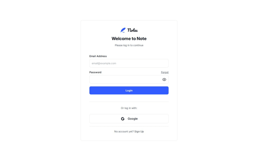
- After I submit the sign up form without any input, it takes about 4 seconds before validation errors show up. You might wanna consider setting very basic client side validation for the cases like that.
I hope my suggestions were helpful, good luck with your other projects.
0

Please log in to post a comment
Log in with GitHubJoin our Discord community
Join thousands of Frontend Mentor community members taking the challenges, sharing resources, helping each other, and chatting about all things front-end!
Join our Discord