Submitted over 1 year ago
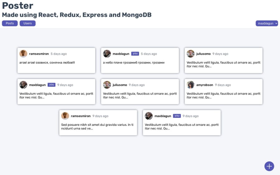
Fullstack application with React, Redux, Express, MongoDB
#express#react#redux#redux-toolkit#mongodb
@davidko5
Design comparison
SolutionDesign
Solution retrospective
Hello everyone,
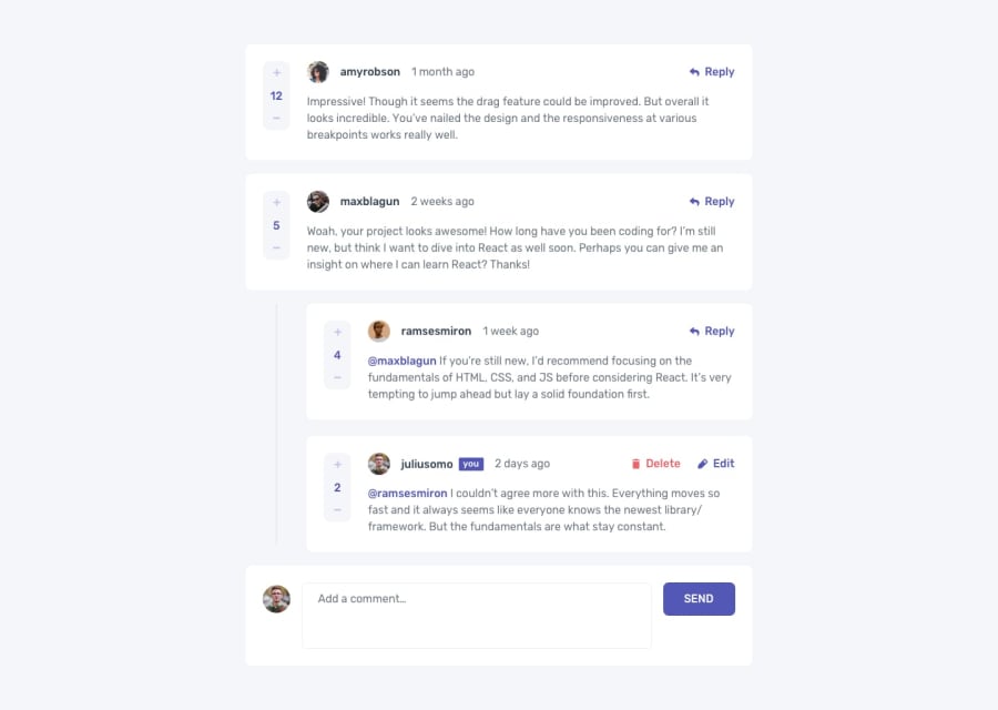
this is my fullstack application, one page of which (page of specific post) is based on design given by frontend mentor. I didn't use any figma wireframe, only images and style guide in .md file.
Please check it out and give me your feedback. What do you think I should pay more attention to and how can I make it to look more professional ? This is one of my portfolio projects so I want it to present me as a developer from the better side.
Thanks for your time!
Community feedback
Please log in to post a comment
Log in with GitHubJoin our Discord community
Join thousands of Frontend Mentor community members taking the challenges, sharing resources, helping each other, and chatting about all things front-end!
Join our Discord
