Design comparison
Solution retrospective
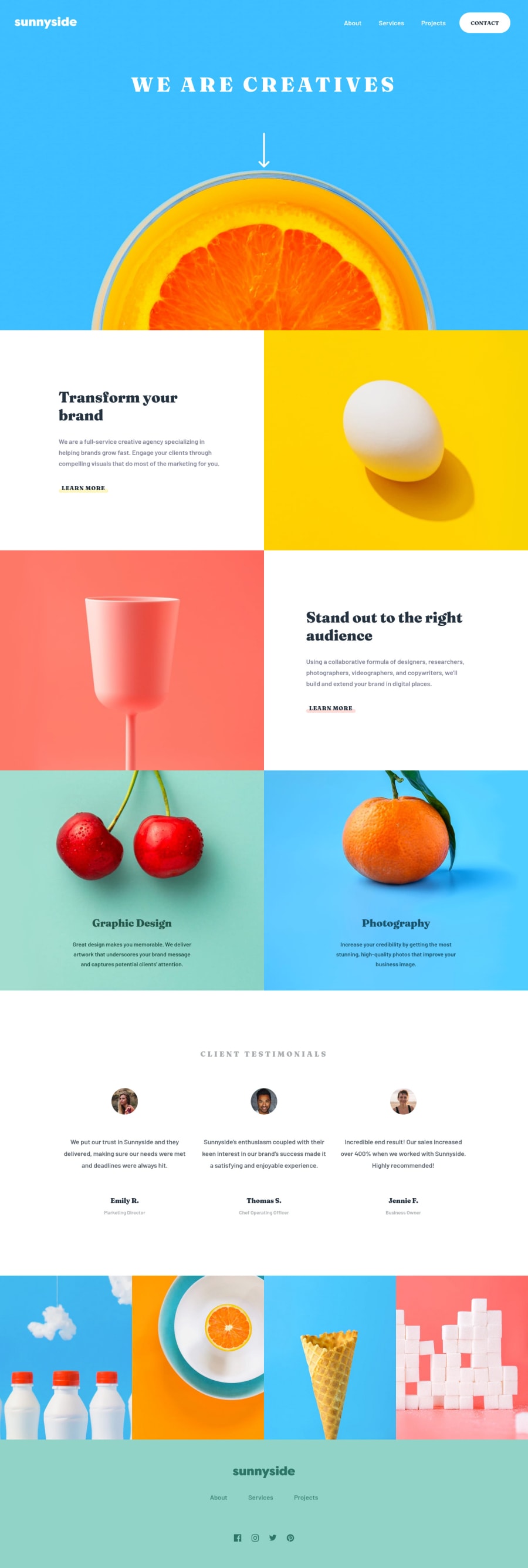
I had a good time building this colorful page!
I wanted to make it full width so I edited some of the images to make them blend nicely with their colored background.
The hero takes the size of the screen but I gave it a min height to prevent display issues on extremely small screens. The arrow is animated (quite crudely, yes) and clicking on it triggers a scroll to the content below.
For the social media links I included the raw SVGs inside the HTML so I could change their color on hover with CSS. I think ideally I should have turned them into a webfont but it felt overkill for just a few icons.
Also I made a favicon because why not.
Any feedback is welcome!
Happy coding everyone :)
Please log in to post a comment
Log in with GitHubCommunity feedback
No feedback yet. Be the first to give feedback on Pipow's solution.
Join our Discord community
Join thousands of Frontend Mentor community members taking the challenges, sharing resources, helping each other, and chatting about all things front-end!
Join our Discord
