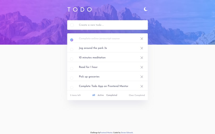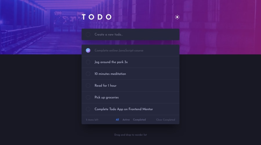
Design comparison
Solution retrospective
Drag and drop was tough lol. Overall architecture needs improvement as well. Pretty sure I can go back in and refactor somethings Oh and it's live so if you test it out, please don't write anything offensive 😕
Community feedback
- @PeshwariNaanPosted over 2 years ago
This looks really good Dorian - nice work. It's really close to the proposed design. About the only suggestion that I would make would be to add a login/register screen where you can create users and sign in existing ones. The way it is set up now, everyone can see everyone else's todos and the app is no longer useful if it pulls up the whole internets todo list. Without the login it would be better to just use local storage so each user only sees what they entered. It would add a lot of complexity and you would need to add a user schema to your data base as well as implement some authentication but its good practice. I just finished this challenge as well and it was my first time with the dnd too. I found a resource that shows how to drag and drop to different lists which is really cool - check it out if you want - it's really useful - https://codesandbox.io/s/zealous-noyce-ewy3j?file=/src/DragList.js Cheers
0
Please log in to post a comment
Log in with GitHubJoin our Discord community
Join thousands of Frontend Mentor community members taking the challenges, sharing resources, helping each other, and chatting about all things front-end!
Join our Discord
