
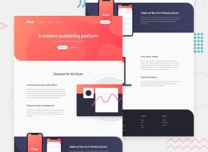
Full Responsive Blogr Landing Page Using SASS And Vanilla JS

Design comparison

Solution retrospective
Any FeedBack Are Welcome.
Community feedback
- @FluffyKasPosted over 2 years ago
Hey,
Overall your solution looks really good! Responsiveness seems fine as well! I'm not quite sure about the animations you added to the navbar (for which you should perhaps use <nav> and not a div). They look a bit unnatural as they come down all the way from the top, crossing the cursor. Their origin should be the link you click on. And perhaps you could animate the opacity for them as well :) That's just probably personal taste though.
There are some issues here which are more important:
-
Why did you add aria-hidden to the nav links? You're hiding the whole navigation from screen readers which is probably not something you ever want to do...
-
For the arrow icons you could leave the alt text empty. Aria-hidden would be appropriate here.
-
The navbar links should not just look like links, you should use <a> for them (wrapped in those <li>s).
-
Your hamburger button should be a <button>. You can nest the image inside this (and leave the alt text empty).
-
Your page should have only one <h1> heading. For the rest you can go <h2>, <h3>... in a descending order. Heading levels play a major role in defining your page's outline.
-
Your footer links should also be <a> wrapped in those <li>s.
-
Everything that isn't inside your header or footer should be contained by a <main> landmark.
-
Not sure what a "down" attribute is but it's being picked up by the report as invalid.
-
Don't nest a <button> element inside an <a>. It's either a <button> OR an <a> element.
I hope this helped a bit with the accessibility issues. ^^
Marked as helpful1@abdraoufxPosted over 2 years ago@FluffyKas Thanks For Your Awesome Feedback, And I Will Try To Fix These Small Problemes ^^ You Just Mention, And I Really Learn So Much From Your Feedback. Thanks.
0 -
- @Esesosa-maxPosted over 2 years ago
- ✅ Good Looking Design on Desktop 3/3 2 .✅ Good Looking Design on Mobile 3/3
- ✅ Readable , Structured HTML 4/5
- ❌ Hamburger Menu should not show on Desktop View
- ✅ Responsiveness
- ❌ Overflow on Mobile ( often unavoidable )
- ✅ Trying A Challenge That is not easy 5 / 5
Marked as helpful1@abdraoufxPosted over 2 years ago@Esesosa-max Thanks Mate For Showing Me Points That I Was Not Keep In Mind, And Thanks For Motivating Me <3. If You Don't Mind When I Ask You To Follow Me To Help Me In Future Designs. And Thanks Again
0@Esesosa-maxPosted over 2 years ago@abdraoufx , Sure I Would Love to have help you in you future design.
Marked as helpful1


Please log in to post a comment
Log in with GitHub
Join our Discord community
Join thousands of Frontend Mentor community members taking the challenges, sharing resources, helping each other, and chatting about all things front-end!
Join our Discord