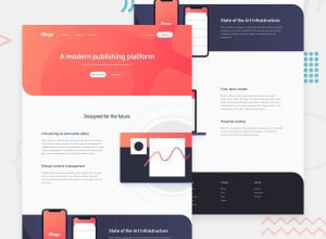
Design comparison
SolutionDesign
Solution retrospective
it was hard
Community feedback
- @mickygingerPosted over 3 years ago
Hey Idkbit! 👋
This looks great! I would recommend revisiting your layout. You might want to think about having a main containing element (something like
main) that has a max-width (maybe1200px).Within each
section(intro, about, speed etc) you could then have two columns. Which are set at50%width, then you can add the content into the correct column.Something like:
body {
  display: flex;
  justify-content: center;
  width: 100%;
}

main {
  max-width: 1200px;
}

section {
  display: flex;
}

section .column {
  width: 50%;
}
Your HTML might look something like:
<body>
  <main>
    <section>
      <h2>Design for the future</h2>
      <column> </column>
      <column> </column>
    </section>
  </main>
</body>
Hope that helps!
1
Please log in to post a comment
Log in with GitHubJoin our Discord community
Join thousands of Frontend Mentor community members taking the challenges, sharing resources, helping each other, and chatting about all things front-end!
Join our Discord
