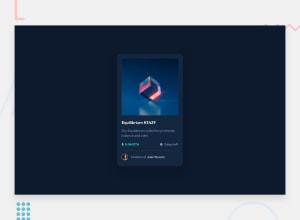
Design comparison
SolutionDesign
Solution retrospective
Feedback is always appreciated ;)
Community feedback
- @AlexKMarshallPosted about 3 years ago
This looks very good, and it adapts well to different screen-sizes.
Be careful about semantics though. You have hover effects on the heading and the person's name. That's implying these should be links, so make sure they have an
<a>tag.Also, make sure you have a
<main>element wrapping your content.Avoid using
pxunits for font-size. For accessibility we want our users to be able to adjust their browser font-size and have our designs adapt to that. Always use eitherremoremto enable that.Marked as helpful1
Please log in to post a comment
Log in with GitHubJoin our Discord community
Join thousands of Frontend Mentor community members taking the challenges, sharing resources, helping each other, and chatting about all things front-end!
Join our Discord
