Design comparison
Community feedback
- @correlucasPosted about 2 years ago
👾Hi Ioan Gheraszim, congrats on completing this challenge!
I saw your preview site and I liked a lot the work you’ve done here, it's almost complete, I’ve some suggestions you can consider applying to your code:
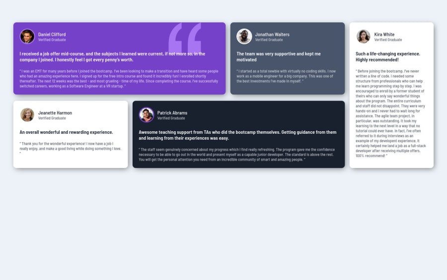
Your component is okay but its missing the vertical alignment. The best way to do it is by using
flexbox. First step is to addmin-height: 100vhto make the body height size becomes 100% of the screen height, this way you make sure that whatever the situation the child element (the container) align the body and then use the flex properties for alignment withdisplay: flex/align-items: center;/justify-content: center;body { min-height: 100vh; background-color: var(--light-gray-blue); font-family: 'Barlow Semi Condensed', sans-serif; font-size: 13px; display: flex; align-items: center; justify-content: center; }Something you can do is to improve your html markup using meaningful tags and replacing the divs. In this case, for example the main block/div that takes all the content can be wrapped with
<main>or section, if you think about = the cards you can replace the<div>that’s wrapping each card with<article>you can wrap the paragraph with the quote with the tag<blockquote>this way you'll wrap each block of element with the best tag in this situation. Note that<div>is only a block element without meaning, prefer to use it for small blocks of content inside bigger blocks wrapped with some better markup.Here's a complete guide for HTML semantic TAGS: https://www.w3schools.com/TAgs/default.asp
✌️ I hope this helps you and happy coding!
1
Please log in to post a comment
Log in with GitHubJoin our Discord community
Join thousands of Frontend Mentor community members taking the challenges, sharing resources, helping each other, and chatting about all things front-end!
Join our Discord
