

Design comparison

Solution retrospective
I have a ton of questions!
-
I started this project by sectioning off and styling with only divs. That worked fine on the small-screen, but I couldn't figure it out on the desktop version. Using display:grid was much easier. How would I do it if I wanted to stick with just divs?
-
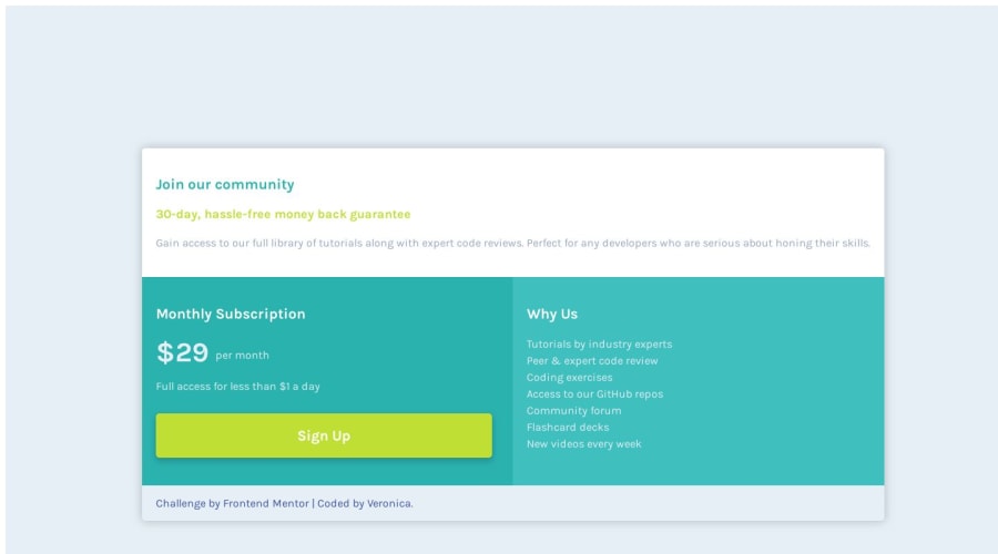
What is the difference between the desktop-design.jpg and the desktop-preview.jpg?
-
I considered using h1, h2, p tags to set up the sections, but I remember an accessibility tutorial said screen readers use those to kind of summarize a page and I wasn't sure if that was applicable here, so I just styled <p> tags. Thoughts on that?
-
I felt like the opacity of the paragraphs was different than what I styled, but is that maybe just a difference in colors?
-
Finally!- In the Why Us section, I originally set it up as a ul, but then changed it to using <br>. Is one way preferred over the other? Or is there a different preferred way to do this?
Please log in to post a comment
Log in with GitHubCommunity feedback
No feedback yet. Be the first to give feedback on Veronica's solution.
Join our Discord community
Join thousands of Frontend Mentor community members taking the challenges, sharing resources, helping each other, and chatting about all things front-end!
Join our Discord