Submitted 12 months ago
Frontend-Mentor-Result-Summary-Component
@yassawambessaw24
Design comparison
SolutionDesign
Solution retrospective
If anyone can point out an error, please let me know that's how i'll learn. Thank you in advance. xoxo
Community feedback
- @pbryan9Posted 12 months ago
Nice work!!
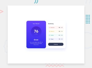
There are a couple of items that will get this a little closer to the design jpg:
- The background colors of each of the 4 score cards on the right should match their text color (yours appear to use green on each).
- Similar minor point on the background color: doesn't quite line up to the spec.
- The contents of each of the cards could use a little breathing room: notice how the score crowds a little close to the edge on the right-hand side of its container (same with the icon on the left side).
- Finally, I think your shadow looks great as-is, but if you want to make it look more like the design you can increase the spread on your box-shadow property.
Happy styling!
Marked as helpful0@yassawambessaw24Posted 12 months agoThank you brother, appreciate it a lot.@pbryan9
0
Please log in to post a comment
Log in with GitHubJoin our Discord community
Join thousands of Frontend Mentor community members taking the challenges, sharing resources, helping each other, and chatting about all things front-end!
Join our Discord
