Not Found
Not Found
Not Found
Not Found
Not Found
Not Found
Not Found
Not Found
Not Found
Not Found
Not Found
Not Found
Not Found
Not Found
Not Found
Not Found
Not Found
Not Found
Not Found
Not Found

Submitted

Frontend-Mentor-Order-Summary

Ric 210

@Ripra87

Desktop design screenshot for the Order summary component coding challenge

This is a solution for...

  • HTML
  • CSS
1newbie
View challenge

Design comparison


SolutionDesign

Solution retrospective


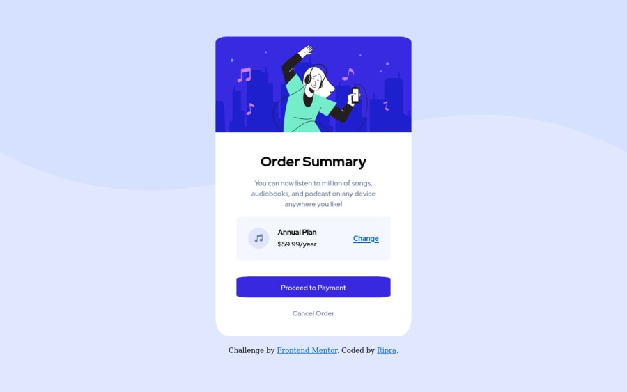
I started this challenge thinking was easy, but it wasn't :P i learnt many new attributes coding this page ) Btw, i have 2 questions: First, again, about the round borders.. (my nightmare!). As you can clearly see from the button (but i have the same problem on all the round borders) the round borders are not round, at the sides there are a kind of "cut" that doesn't allow to complete the radius, and i really don't know how to fix it.. Second, to easily manage the text style in the button , i add inside the button tag the paragraph tag (<button><p> text </p></button>) but doing this i lost the pressure characteristic typical of the button when you press it. I did this because using only the button tag i wasn't able to change the text style (as color and font), anybody knows how to do it? Thanks everybody in advance! )

Community feedback

Fritz 300

@fritzadelbertus

Posted

Hello @Ripra87. First of all, congratulations on finishing this challenge! Here are some few suggestion I can give:

  • The rounded border problem, to implement better rounded border use units in pixel. Using percentage in border-radius is useful to create ellipse looking element but not recommended to create rounded borders. try changing the border-radius:10% to border-radius:20px, it should solve that problem.

  • I see your css styles haven't implement display: flex or display: grid yet. I recommend you start using them. Margin and padding is useful to create spaces between element but flexbox and grid are powerful tools to create complex layouts.

I hope it's helpful and happy coding!

Marked as helpful

0

Ric 210

@Ripra87

Posted

@fritzadelbertus Hi Fritz and thank you so much! i changed the borders using px instead of % and now it works! About the dispaly, i still never used the grid, but i used display flex in this project in the body and in the main to center all the components (center for the body and column for the main) and also inside the plan infomations (where is the link change) with the row, should have i used it somewhere else? Thank you )

0
Fritz 300

@fritzadelbertus

Posted

@Ripra87 In the card content, I see you used margins to space the top and bottom part of the content. Instead, you can wrap the whole content in a <article> tag and create spacing between the <article> and the outer layout. The spacing between plan-info and change div can also be implemented using flex and justify-content:space-between for a more responsive result.

Marked as helpful

1

Please log in to post a comment

Log in with GitHub
Discord logo

Join our Discord community

Join thousands of Frontend Mentor community members taking the challenges, sharing resources, helping each other, and chatting about all things front-end!

Join our Discord