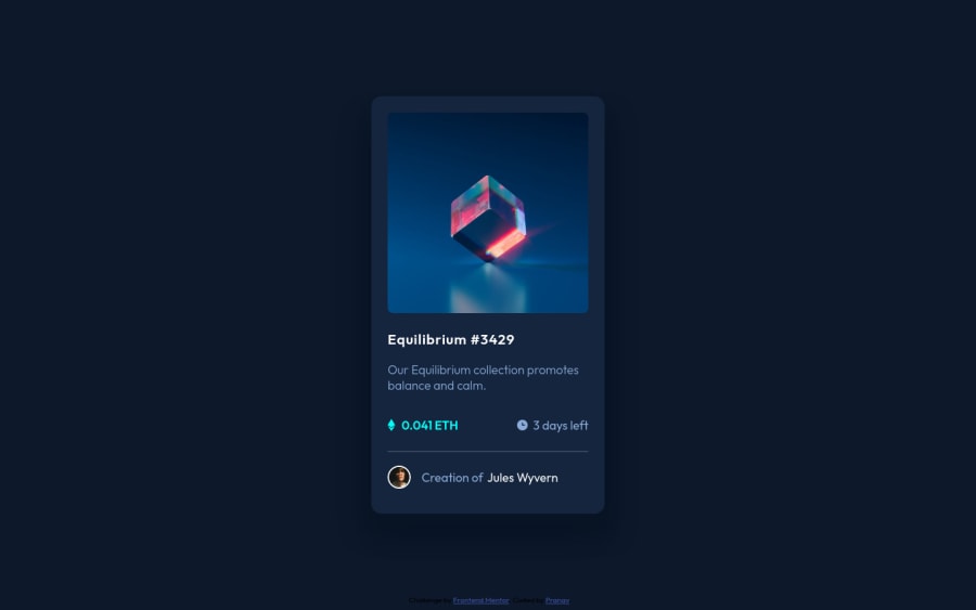
Design comparison
Solution retrospective
It's been a great project. I loved to do it. I have also learnt something new in order to make this project and thoroughly I enjoyed working on this project.
Thank You, Frontend Mentor for giving me this project as an opportunity.
Community feedback
- @pikapikamartPosted almost 3 years ago
Hey, awesome work on this one. The layout in general looks great I think.
MikevPeeren already pointed out a great tip, just going to add some other suggestions as well on the site:
- It would be great to have a base styling of this:
html { box-sizing: border-box; font-size: 100%; } *, *::before, *::after { box-sizing: inherit }
This way, handling an element specially its size will be easier because of the
box-sizing
- Remember that whenever you create a site, always have a
main
tag that will wrap the main-content of the site. For this one, you can usemain
on the.card
selector since that is the main-component. Then on the.attribution
usefooter
tag on it so that it will be its own landmark. - Don't use
position: absolute
a very large element. If you inspect your layout, hover on eitherhtml
orbody
tag, you will notice that it has no height since its element is beingabsolute
. Since you are just using this to center the layout, it would be much better to do it this way. But first, remove these stylings on the.card
selector:
position top left transform
Also remove the
position
on the.attribution
as well. Then on thebody
tag, you can add these stylings:align-items: center; display: flex; flex-direction: column; justify-content: center; min-height: 100vh;
This way, even if you zoom out or when a user have wide-screen, content will be centered properly. Though by using this one, I noticed that the overlay for the image is out of place, try to use
position: relative
on the parent container of that overlay so that it will be contained properly.- When using
img
tag, you don't need to add words that relates to "graphic" such as "image" and others, sinceimg
is already an image so no need to describe it as one. - Also, since you are treating the image as an interactive component, make sure that there is an interactive element present beside or nesting it. It could be a
button
if the component for example, clicking it would preview the nft image or usea
tag if clicking the image will navigate user in another page to see the full nft information? - Also for the overlay
img
, it is only decorative. Decorative images should be hidden for screen-reader at all times by usingalt=""
andaria-hidden="true"
to theimg
tag or onlyaria-hidden="true"
if you are usingsvg
instead ofimg
tag. - Since you are not using
h1
as the nft name and anh1
should be present on a page, for this one, theh1
would be a screen-reader only heading. Meaning it will be hidden visually but present for screen-reader users. On this, theh1
would have likesr-only
class and the text-content should describe what is the main-content is all about. Theh1
could be placed as the first text inside themain
.Have a look at this snippet of mine about screen-reader only h1 usage You can use something like afrontendmentor nft collection
as the text-content of theh1
. - Change the nft name to
h2
. When using a heading tag, make sure you are not skipping a level. If you useh3
then make sure thath1, h2
are all present before it. - Lose the
icon
word for the ethereum and for the clock icon, it is only decorative so hide it using the method I mentioned above. - Person's image should be using the person's name as the
alt
value likealt="Jules Wyvern"
. Components like this where a person's information is presented, make sure to use their name as the person'simg
alt
value. - The person's name as well is being treated as an interactive component. Wrap the person's name in a
a
tag since it looks like a link to see the nft creator.
Aside from those, great job again on this one.
Marked as helpful1@Pranav1326Posted almost 3 years ago@pikapikamart
First of all, Thank You so much for your guidance. I really appreciate that.
I will try to make those changes that you mentioned and make it perfect.
1 - @MikevPeerenPosted almost 3 years ago
Hey 👋
Good job finishing this one, try to keep in mind however when to use alt texts, for example for the icons it isn't needed but for the image a more descriptive text should be used.
Marked as helpful1@Pranav1326Posted almost 3 years ago@MikevPeeren
Thank You so much for your guidance. I really appreciate that.
0
Please log in to post a comment
Log in with GitHubJoin our Discord community
Join thousands of Frontend Mentor community members taking the challenges, sharing resources, helping each other, and chatting about all things front-end!
Join our Discord