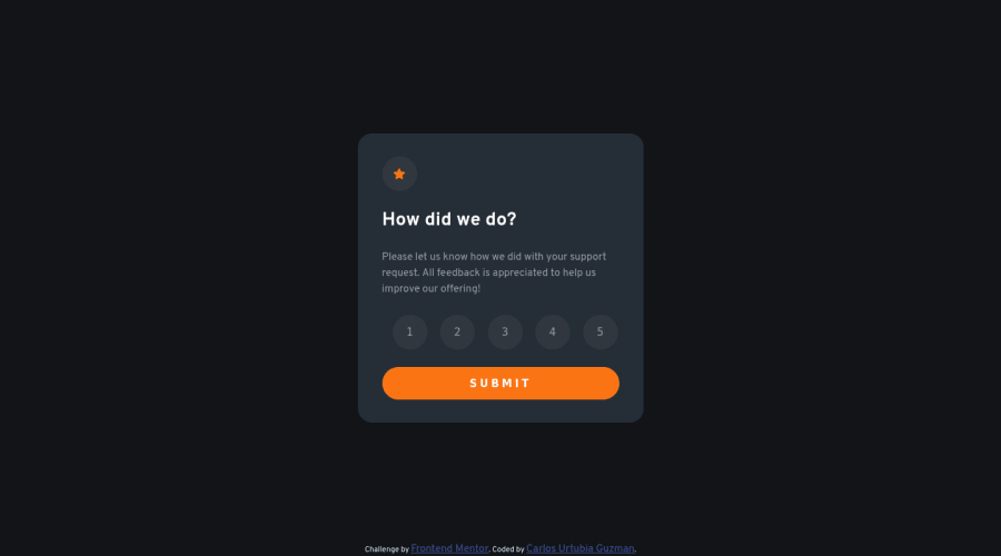
Design comparison
SolutionDesign
Solution retrospective
I'm a web developer apprentice, any feedback is welcome
Community feedback
- @purnimakumarrPosted over 2 years ago
Hi Carlos,
- There are 3 accessibility issues in your code which can be solved by using HTML5 semantic tags. You can wrap the
<section class="card__container1"></section>
and<section class="card__container2"></section>
in a<main></main>
tag and the attribution in a<footer></footer>
tag. This will make your code more accessible. So, your code would look something like this:-
<main> <section class="card__container1">content goes here</section> <section class="card__container2">content goes here</section> </main> <footer> <div class="attribution">content goes here</div> </footer>
- Also, you can make the Rating Component more interactive by adding an alert in case a user tries to submit the feedback wihtout selecting a rating, stating something like "Please select a valid rating". This will make the component more interactive.
Marked as helpful1 - There are 3 accessibility issues in your code which can be solved by using HTML5 semantic tags. You can wrap the
- @codexshellPosted over 2 years ago
Holla! Nice design, real great. Got some few suggestions that I think would make it even better. You could try to persist the active state (the orange coloring) on a rating when one clicks away from the buttons. Also the tab key is triggering the active state on ratings, rather than a focus state. Would be nice to check out Mozilla Developer Network for more information. Cheers!
Marked as helpful1
Please log in to post a comment
Log in with GitHubJoin our Discord community
Join thousands of Frontend Mentor community members taking the challenges, sharing resources, helping each other, and chatting about all things front-end!
Join our Discord