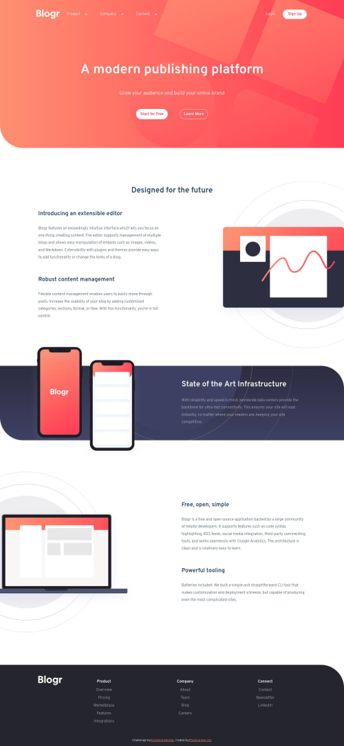
Submitted almost 4 years agoA solution to the Blogr landing page challenge
Frontend-Mentor-Blogr using HTML CSS JS
@PhoenixDev22

Solution retrospective
Hello community, I've completed another frontend mentor , I had a challenging time making it.
I have a question about setting max-width to body that the website doesn't stretch all on larger desktops (more than 1440px) , and the design messes up.
Any suggestions about the accessibility?
Please share your thoughts !There’s still some more to do like the readme, cleaning up repeating code, and html warnings.
I'd appreciate any comments for improvements or anything I've missed. Thank you!
Code
Loading...
Please log in to post a comment
Log in with GitHubCommunity feedback
No feedback yet. Be the first to give feedback on PhoenixDev22's solution.
Join our Discord community
Join thousands of Frontend Mentor community members taking the challenges, sharing resources, helping each other, and chatting about all things front-end!
Join our Discord