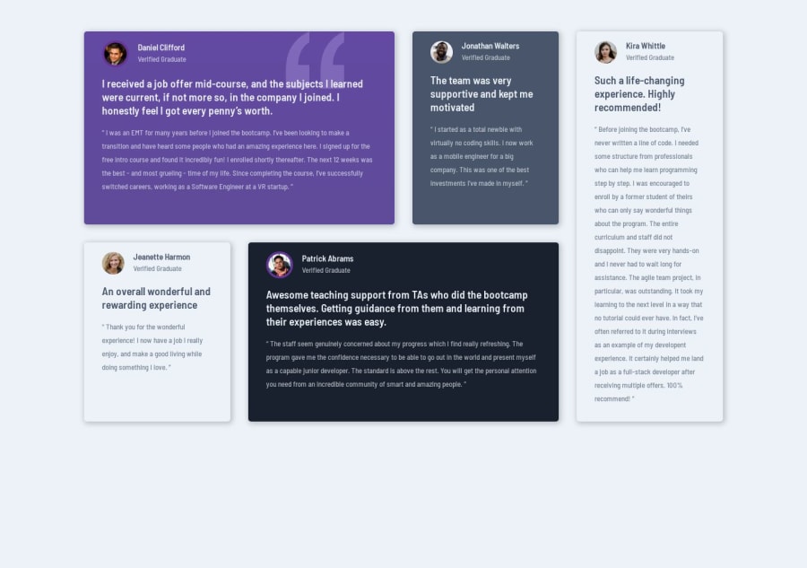
Design comparison
Solution retrospective
I used mobile first, css grid colums and template areas to create this testimonial grid
Community feedback
- @alessandro-chrystianPosted about 1 year ago
Thank you for showing us your project, by seeing it I had some ideas to make mine, such as making a tablet version of the website, I did it in mine because I saw it in yours. By the way, the fact that you made it in Mobile First helped me with some troubles I was having in the responsivity of my project.
1@m1mmseenPosted about 1 year ago@alessandro-chrystian thank you a lot for your feedback. i get very many inspiring ideas from kevin powell. the link directs to his youtube channel. mobile first design has revolutionized my work with CSS :D now it's not that frustrating at all :)
1@alessandro-chrystianPosted about 1 year ago@m1mmseen I'm gonna take a look at his channel. My problem was that I spent too much focus on the desktop version that I forgot the other ones, basically I started from the end and that's why I had some trouble. I believe mobile first design is great because we will always start our project developing in a simple way, thus we don't break steps.
1@m1mmseenPosted about 1 year ago@alessandro-chrystian yes, you are absolutly right. in addition mobile first leads to a better performance and therefore user experience.
1
Please log in to post a comment
Log in with GitHubJoin our Discord community
Join thousands of Frontend Mentor community members taking the challenges, sharing resources, helping each other, and chatting about all things front-end!
Join our Discord
