Not Found
Not Found
Not Found
Not Found
Not Found
Not Found
Not Found
Not Found
Not Found
Not Found
Not Found
Not Found
Not Found
Not Found
Not Found
Not Found
Not Found
Not Found
Not Found
Not Found

Submitted

Frontend Recipe Page, kinda complete

oduwa-A• 120

@oduwa-A

Desktop design screenshot for the Recipe page coding challenge

This is a solution for...

  • HTML
  • CSS
1newbie
View challenge

Design comparison


SolutionDesign

Solution retrospective


What are you most proud of, and what would you do differently next time?

I was proud of the formatting in the HTML, as it made the CSS portion significant easier.

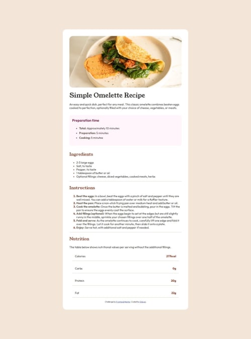
What challenges did you encounter, and how did you overcome them?

The image was a toughie, and I only managed to overcome it in the desktop portion by putting the image inside the container image. On mobile, I don't know how to "grow" it to fill the whole space.

What specific areas of your project would you like help with?

The text and bullet points would be good for starters, as I had no idea how to really separate them from one another and I had no idea how to leave the bullets all the way to the left. Really please rip into this whole project and lemme know everything I can fix.

Community feedback

Csaba Hell• 110

@hellcsaba

Posted

Hi Oduwa,

You did a good job for the solution, it's easy to read and understand. Unfortunately I couldn't check you live solution because the website is pending. I took a look on your code and here's what I can suggest you:

  • Try to use semantic HTML whenever is possible instead of divs. Some of the semantic like main, header, footer, article, section elements. For example you can change the recipe-page div for main.
  • For the texts you can use line-height property to make it similar to the design.
  • You used the li:marker pseudo element. There you can change the font-size which results in a different size of bulletpoint.
  • If you target the list items li and change their padding-left then it will have more distance from the bulletpoints.
  • To align the bulletpoints all the way left you can manage to do it by setting the padding-left of the ol and ul elements.

I love that you used rem values in your code. I hope I could help you. Keep up the good work!

0
P
Steven Stroud• 4,040

@Stroudy

Posted

Hey, Love the fact you completed this challenge, some things I noticed,

  • * {max-width: 100%;} you don't want this to affect every element, Instead you should apply a full modern reset to make things easier as you build, check out this site for a Full modern reset
  • Using max-width: 100% or min-width: 100% is way more responsive then just width:100%, check out this article also from the same Frontend mentor dev responsive-meaning, she goes into more detail.
  • Using a naming convention like BEM, Using proper naming will prepare you for the changes in design of the website.
  • Having better alt="" descriptions for accessibility is a must check this out Write helpful Alt Text to describe images,
  • Missing a <meta> description tag for SEO purposes,
  • It is best practice to have a <main> tag inside your body highlighting the main section.
  • To separate the bullet points from the text you could use padding-left: 1rem; to your <li> element, To be more specific give the <li> class names to target them each if the spacing is different.

I hope this help and i look forward to hearing more from you, Happy Coding!

0

Please log in to post a comment

Log in with GitHub
Discord logo

Join our Discord community

Join thousands of Frontend Mentor community members taking the challenges, sharing resources, helping each other, and chatting about all things front-end!

Join our Discord