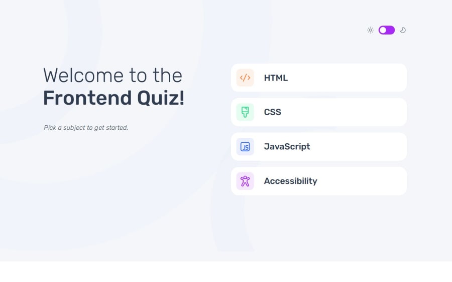
Design comparison
Solution retrospective
This project turned out to be quite challenging. Unfortunately, limited time made it a lengthy process to complete. Each time I took a break, resuming with a fresh understanding of the code proved difficult. JavaScript presented its own set of hurdles, and the responsive design across different devices was especially complex. I’ve decided that in future projects, I’ll start with a detailed sketch. While I began with mobile and moved up to tablet and desktop, I faced unique challenges at each breakpoint, often requiring code adjustments. I also learned that separating media queries into a dedicated file made reading and updating the code much easier. On multiple occasions, I accidentally altered my original code, causing issues. Overall, it was a long marathon for me, but I’m pleased with the result.
What challenges did you encounter, and how did you overcome them?Initially, I created separate HTML pages for each option and navigated between them via JavaScript. Using different pages might seem a bit excessive for a small project like this, but I wanted to try it out. However, I encountered various issues, the biggest being that dark and light mode settings had problems despite saving them in localStorage. Later, I restructured almost everything into a single HTML document, which made things easier. I’d be very grateful for any suggestions or help from anyone who has experience with multiple HTML pages.
What specific areas of your project would you like help with?I am gladly open to any suggestions!
Community feedback
- @GodinhoweversonPosted 5 months ago
Great Job!
Marked as helpful1
Please log in to post a comment
Log in with GitHubJoin our Discord community
Join thousands of Frontend Mentor community members taking the challenges, sharing resources, helping each other, and chatting about all things front-end!
Join our Discord
