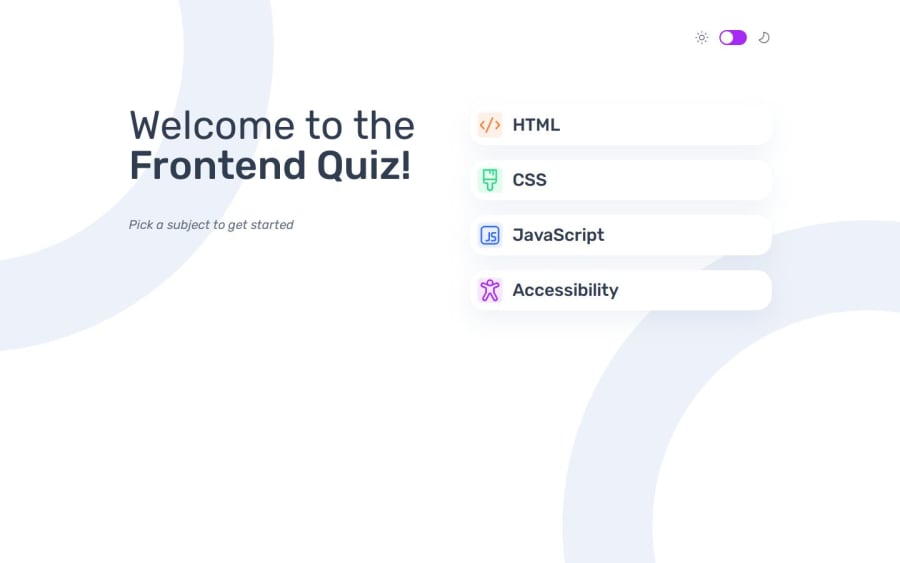
Design comparison
Solution retrospective
I defined semantic color tokens in Tailwind CSS, to adhere to the convention set in the Figma design File.
What challenges did you encounter, and how did you overcome them?.
What specific areas of your project would you like help with?.
Community feedback
- P@Fable54321Posted 5 months ago
Ok so first, functionnality wise, this is really close to perfect. Everything is working as intended.
Now obviously there is quite a few design details that are not looking close enough to the given design.
It is a pretty big project so I imagine what happened is that you focused on the functionnalities and might not have had the motivation to fix the little issues afterwards.
I can totally understand that because I felt like that on mulitple occasions doing this project, but I will tel you that you should still take the time to correct these little details.
If you feel tired with the project, take a break of this one for the rest of the day and come back the next day with a fresh head, it is what I did more than once with this one.
I would say the only thing that is actually bothering for usability is the fact that your selected choice stays selected after changing question.
Also, maybe the score tile that is plain white on plain white makes it lookt weird.
Overall, good job, keep up !
0
Please log in to post a comment
Log in with GitHubJoin our Discord community
Join thousands of Frontend Mentor community members taking the challenges, sharing resources, helping each other, and chatting about all things front-end!
Join our Discord
