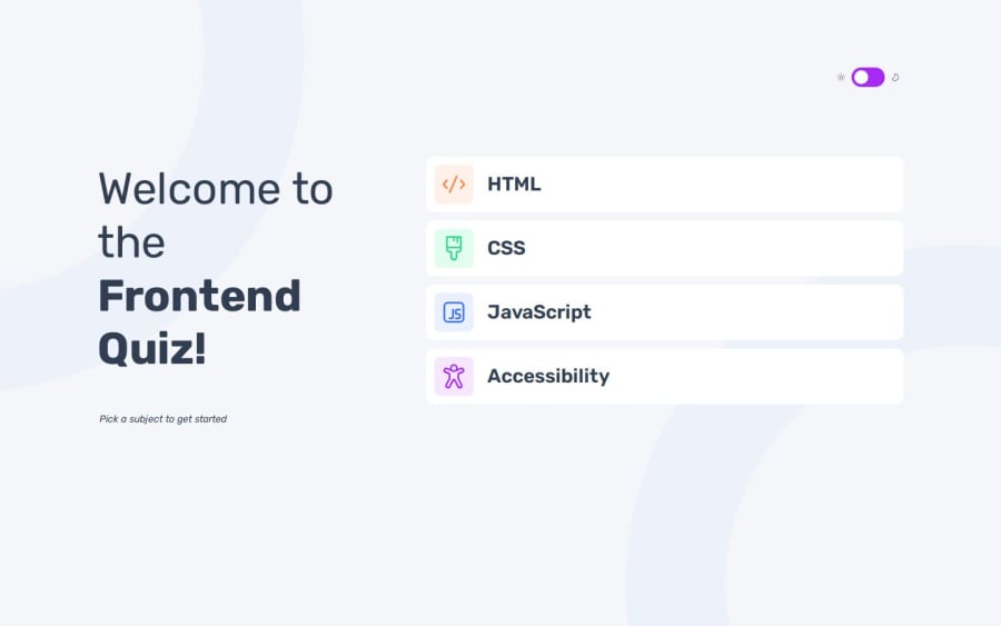


Design comparison
SolutionDesign

Solution retrospective
What are you most proud of, and what would you do differently next time?
I managed to do it
What challenges did you encounter, and how did you overcome them?the dark mode, we can't even switch between the modes by clicking the switch button
What specific areas of your project would you like help with?how it turned out overall, what else should I improve
Community feedback
- P@srijanssPosted 8 months ago
- Your solution includes semantic HTML
- Keyboard navigation is not working, you can look into tabindex attribute or keydown event for different interactive elements in your app
- Layout looks good on different screen sizes, except some mid breakpoints where layout squeezes too much. You can look into CSS grid and flexbox layout for easy layout of components. And also you can use breakpoints like 550px for mobile, 768px for tablet and 1200px for desktop in this case as content width is 1160px.
- You have used Vue3 to build this app, so the code is nicely structured , readable and resuable
- Some of the layout and fonts doesn't match with the design, so the solution differ a bit from the actual design
Good work.
0

Please log in to post a comment
Log in with GitHub
Join our Discord community
Join thousands of Frontend Mentor community members taking the challenges, sharing resources, helping each other, and chatting about all things front-end!
Join our Discord