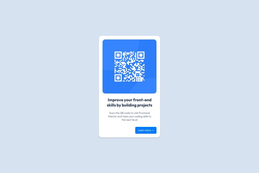
Frontend Newbie QR Code Card with pure HTML & CSS


Design comparison

Solution retrospective
For this solution, I decided to follow the tips very faithfully, which I think was my best decision. Specifically:
- First, I built the structure of the card "component", carefully thinking about which tags to use and specifically trying not to use divs unnecessarily.
- Next, instead of starting to work on the CSS, I asked ChatGPT to analyze my code, which gave me some very good insights into certain tags, like <main>, <p>, and <footer>.
- Then, after replacing some divs with the tags I just mentioned, I started working on the CSS. For the first time, I remembered to reset my CSS with the snippet below, which made everything flow better:
*,
*::before,
*::after {
    margin: 0;
    padding: 0;
    box-sizing: border-box;
}
- I Googled how to use BEM conventions for naming my classes.
- Lastly, I applied some animations and added a button that leads to The Frontend Mentor website.
Well, I'm an experienced Backend and Data Engineer, but struggle a lot with frontend, specially with layouts, using semantic tags and accessibility features such as ARIA labels. Specifically for this small project, my main struggles were:
- Deciding where to use padding and where to use margins. I find myself constantly thinking if the maintenance is going to scale well if I add a padding here or a margin there.
- Dealing with images. I honestly don't know if there's a missing piece of CSS for the QR Code image. I don't know if it's responsive or not.
- I was not sure about which unit to use for font-sizes.
So any feedback on these topics will be highly appreciated 😊.
What specific areas of your project would you like help with?- Did I import the "Outfit" Google Font correctly? I copied and pasted the code directly from Google’s font page. Is there a better way to do this?
- What’s a good strategy for organizing my color palette or theme? Should I use CSS custom properties (variables)? Are there any common conventions, such as defining primary and secondary colors?
- Can someone explain if px is the best unit for padding, margin, border-radius, box-shadow, max-width, and font-size? And why is that?
- Is my solution responsive? If so, how can I verify this? What key factors should I consider to determine whether something is responsive or not?
Community feedback
- P@huyphan2210Posted about 2 months ago
Hi @medina325,
I've seen your solution and I'd like to share my thoughts:
CSS Simplification
In your CSS, I noticed this snippet:
*,
*::before,
*::after {
    margin: 0;
    padding: 0;
    box-sizing: border-box;
}
This can be simplified to:
* {
    margin: 0;
    padding: 0;
    box-sizing: border-box;
}
The
::beforeand::afterpseudo-elements are only applied when explicitly defined in your CSS for specific elements. Since they're not used in this challenge (and likely in similar ones), keeping your code concise improves clarity.Semantic HTML
Your HTML is semantic, which is great! One small suggestion: always start with an
<h1>before using<h2>,<h3>, etc., to create a proper heading structure. For example:<h1>Main Heading</h1> <h2>Subheading</h2>This helps screen readers and search engines better understand the content hierarchy.
Font Imports
You correctly imported the "Outfit" font with this:
<link href="https://fonts.googleapis.com/css2?family=Edu+NSW+ACT+Foundation:wght@400..700&family=Outfit:wght@100..900&display=swap" rel="stylesheet">However, it looks like you also imported "Edu NSW ACT Foundation" unnecessarily. It’s likely an accidental addition while browsing fonts. A cleaner version would be:
<link href="https://fonts.googleapis.com/css2?family=Outfit:wght@100..900&display=swap" rel="stylesheet">Alternatively, you can import fonts in your CSS file like so:
@import url('https://fonts.googleapis.com/css2?family=Outfit:wght@100..900&display=swap');Colors and Variables
When it comes to colors, using CSS variables (--var-name) can help organize and reuse values efficiently. For instance:
:root {
    --primary-color: #3498db;
    --secondary-color: #2ecc71;
}

button {
    background-color: var(--primary-color);
}
However, if a color is only used once, it’s fine to avoid creating a variable.
CSS Units
I separate CSS units into two categories:
- Absolute Units:
- Use
pxfor precise sizing (e.g., borders or icons). However, it doesn't scale well for responsiveness.
- Relative Units:
rem: Relative to the root font size (default1rem=16pxbut customizable).vw/vh: Relative to the viewport's width or height.%: Relative to the size of the parent element (for most properties).
For responsiveness, I recommend combining units like
vw,vh, and%with tools such as:- CSS properties:
min-width,max-height. - Functions:
calc(),clamp(),min(), andmax(). - Media queries: To adapt layouts for different viewport sizes.
Browser DevTools
Your browser's Developer Tools (DevTools) are incredibly helpful for debugging and testing. They allow you to:
- Inspect HTML and CSS elements
- Simulate devices with different viewport sizes (a viewport is the visible area of a webpage)
- Test responsiveness
While simulations are not a perfect replacement for testing on real devices, they’re cost-effective and useful for quick checks.
Hope this helps!
Marked as helpful2@medina325Posted about 2 months ago@huyphan2210 Wow! Thank you so much for the feedback, I admit I was expecting to be ignored for a very long time after submiting the solution to this first challenge😂.
Thanks for the all the tips, I'll definitely remember them.
1

Please log in to post a comment
Log in with GitHub
Join our Discord community
Join thousands of Frontend Mentor community members taking the challenges, sharing resources, helping each other, and chatting about all things front-end!
Join our Discord