

Design comparison

Solution retrospective
I'm happy to just finish this to be honest. It was tough for me. I had to use someone's solution as reference to complete this.
What challenges did you encounter, and how did you overcome them?just making the grid look how it should was horror for me.
What specific areas of your project would you like help with?If you have any advice, do share. Definitely not my best work though. Code is messy too.
Community feedback
- @MohammedOnGitPosted 7 months ago
Hello TheTrueScout!!!
Your HTML structure for the Bento grid layout looks great! It follows a clear pattern, making it easy to read and maintain. Here are a few suggestions for further refinement:
- Image Alt Text Your alt text for images should be more descriptive for screen readers. Instead of repeating the file name, describe the image content:
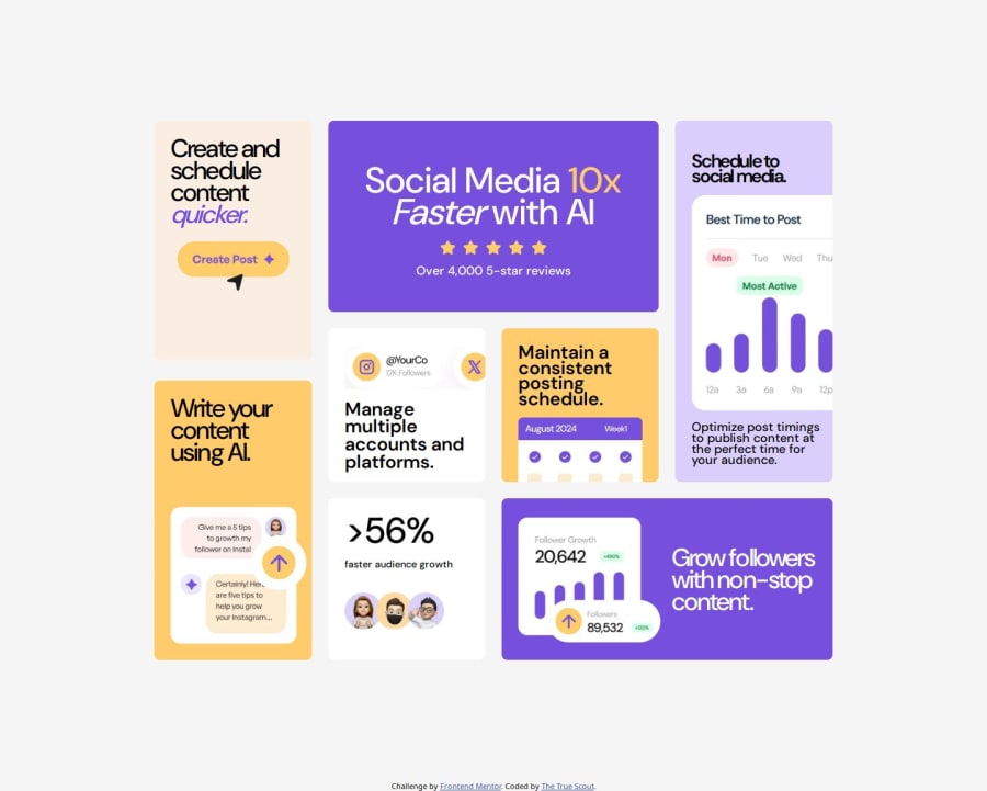
<img src="assets/images/illustration-grow-followers.webp" alt="Illustration showing followers growth over time">- Header Hierarchy Maintain consistent heading hierarchy for accessibility and SEO purposes. You should avoid jumping from h1 to other sizes like h1--medium. Instead, use h2, h3, etc. Here’s an example:
<h2 class="h2--medium col-white">Grow followers with non-stop content.</h2>- Sectioning for SEO You can group your grid items within semantic tags like <section> or <article> to improve SEO and accessibility. Example:
<section id="block-1" class="container__card container__card--purple500 container__card--TextAlign-center"> <h1 class="col-white h1-mg-TopBot">Social Media <span class="col-yellow500">10x</span> <span class="style-Italic ">Faster</span> with AI</h1> <img src="assets/images/illustration-five-stars.webp" alt="Five-star rating illustration"> <p class="col-white">Over 4,000 5-star reviews</p> </section>- Meta Description For SEO purposes, adding a meta description will help search engines understand your content better:
<meta name="description" content="Boost your social media management with AI-powered tools, optimize schedules, and grow followers effortlessly.">These changes will help improve the performance, accessibility, and maintainability of your project but hey!!! you did great. Keep it up. Happy coding!!!
Marked as helpful0@TheTrueScoutPosted 7 months ago@Aggressive-Mohammed Thank you for the great feedback! I will keep these in mind and try to improve : )
1 - @grace-snowPosted 7 months ago
Great job!
Like I said on Discord, try to update the heading levels and image alts, but that's about it.
Marked as helpful0


Please log in to post a comment
Log in with GitHubJoin our Discord community
Join thousands of Frontend Mentor community members taking the challenges, sharing resources, helping each other, and chatting about all things front-end!
Join our Discord