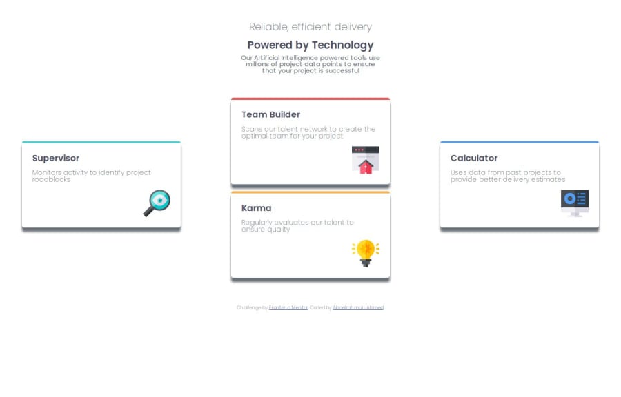
Frontend-Mentor|Four card feature section


Design comparison

Solution retrospective
I've became much better at using display flex and grid but there are much more to learn. Maybe next time I will add a tablet version for the website and make the shadowbox more settle.
What challenges did you encounter, and how did you overcome them?Making the grid for the desktop version was a little bit hard. But after a few videos and tutorials I came to understand how it can be done.
What specific areas of your project would you like help with?Can this layout be achieved without using transform?
Community feedback
- @VasanthakumarBPosted about 2 months ago
Positive Points:
The structure with the hero section and card grid is well-organized Good use of Tailwind classes for styling Nice implementation of responsive grid using md:grid-cols-3 Consistent spacing and padding patterns
Areas for Improvement:
Semantic HTML & Accessibility:
The hero section could use a <main> tag to better define the primary content Card headings should be consistent - currently using a mix of <h3> and <h4> Images lack meaningful alt text, which is crucial for screen readers Consider adding ARIA labels for the feature cards The color contrast for gray text (text-gray-600) might need checking against WCAG standards
Responsive Design:
The cards could benefit from better padding on mobile - p-6 might be too tight Consider adding a lg: breakpoint for larger screens The grid gap (gap-6) could be adjusted for different screen sizes Text sizes could be more responsive with different breakpoints
0

Please log in to post a comment
Log in with GitHub
Join our Discord community
Join thousands of Frontend Mentor community members taking the challenges, sharing resources, helping each other, and chatting about all things front-end!
Join our Discord