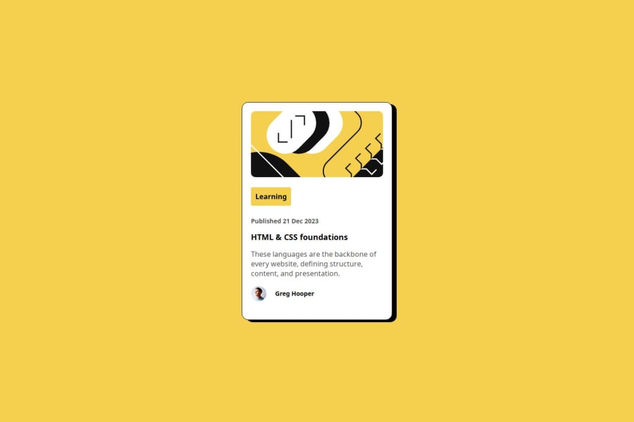
Design comparison
SolutionDesign
Community feedback
- P@cravskyPosted 6 months ago
Hi, congratulations on finishing this challenge!
There are some areas that could be improved.
- You can use css variables to define colors and reuse them across your project. That way it is easy to replace color in all places at once. LINK
// example :root { --yellow: hsl(47, 88%, 63%); --white: hsl(0, 0%, 100%); --gray-500: hsl(0, 0%, 42%); --gray-950: hsl(0, 0%, 7%); } p { color: var(--gray-500); }- Border on your card seems a little thick, you may try
border: 1px solid black; - You may want to adjust image border-radius
- There is a way to auto-format your html with keystroke
Shift+Alt+F(on window)
I hope that helps, happy coding!
Marked as helpful0
Please log in to post a comment
Log in with GitHubJoin our Discord community
Join thousands of Frontend Mentor community members taking the challenges, sharing resources, helping each other, and chatting about all things front-end!
Join our Discord
