Design comparison
SolutionDesign
Community feedback
- @sulemaan7070Posted over 1 year ago
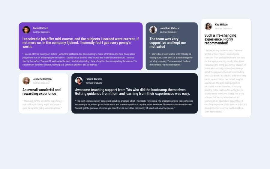
hey Jerico😄, here are a few things to make the site design accurate..
1.Add shadows to the grid sections.
2.In the grid1 there should be
quote svgwhich should be positioned absolutely to the grid1.3.reduce the border-radius for the sections or divs.
4.center the whole container. by adding height to the main
main {
    min-height: 100vh;
}
this has worked give it a try
Happy coding👍🏻😄💯
Marked as helpful0 - @0xabdulkhaliqPosted over 1 year ago
Hello there 👋. Congratulations on successfully completing the challenge! 🎉
- I have other recommendations regarding your code that I believe will be of great interest to you.
HEADINGS ⚠️:
- This solution has generated accessibility error report due to lack of level-one heading
<h1>
- Every site must want at least one
h1element identifying and describing the main content of the page.
- An
h1heading provides an important navigation point for users of assistive technologies, allowing them to easily find the main content of the page.
- So we want to add a level-one heading to improve accessibility by reading aloud the heading by screen readers, you can achieve this by adding a
sr-onlyclass to hide it from visual users (it will be useful for visually impaired users)
I hope you find this helpful 😄 Above all, the solution you submitted is great !
Happy coding!
Marked as helpful0
Please log in to post a comment
Log in with GitHubJoin our Discord community
Join thousands of Frontend Mentor community members taking the challenges, sharing resources, helping each other, and chatting about all things front-end!
Join our Discord
