Submitted about 3 years ago
Frontend Mentor - Testimonials grid section solution

@francobwogo

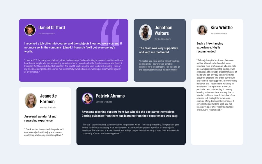
Design comparison
SolutionDesign

Solution retrospective
Feedback needed.
Thanks, Francis.
Please log in to post a comment
Log in with GitHubCommunity feedback
- @hyde-brendan
Hi! Nice job completing the challenge. A couple comments:
- The images becoming squashed whenever the name overflows to a second line can be fixed by adding an
align-selfto eitherstartorcenterto your<img>elements. On that note though, the images are a bit larger than on the design (around 30px); you can afford to shrink them. - On that note, I would reduce the font size of the
<h1>elements to prevent the peoples' names from taking multiple lines. The design has the same size as the main text (13px). - I would increase the font size of the
.main-textelements to somewhere between 18px to 20px. - Remove the
background-sizeproperty from.order-1; the stretching doesn't make the quotation mark look nice, and once you shrink the card header a bit it'll look more like the design anyhow.
Hope this helps! For future work, see if you can use
grid-template-areasfor the layout, and multiple media queries for multiple layouts for tablets.Marked as helpful - The images becoming squashed whenever the name overflows to a second line can be fixed by adding an
- @EmmanuelHexer
Great work overall man. Keep it up


Join our Discord community
Join thousands of Frontend Mentor community members taking the challenges, sharing resources, helping each other, and chatting about all things front-end!
Join our Discord