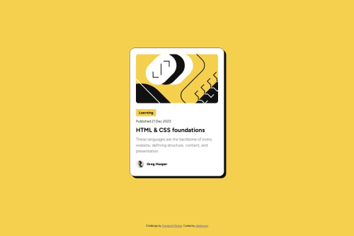
Frontend Mentor - Solución a la tarjeta de vista previa de blog 📝

Solution retrospective
I am particularly proud of how I have incorporated the styles defined in the Figma file from the start. This has ensured that my design is more faithful to the provided style guide. Unlike my first challenge, where I did not pay much attention to these details, this time I focused on maintaining visual consistency and accuracy.
For future projects, I plan to use Google Lighthouse to measure the quality of my code, especially in terms of accessibility. This tool will be invaluable for identifying areas of improvement and making justified changes based on concrete data. In this way, I can ensure that my projects not only look good but are also accessible to all users.
What challenges did you encounter, and how did you overcome them?One of the challenges I encountered was adjusting the line height in paragraphs. I did not quickly identify the need to modify this property, which cost me valuable time at the beginning of the project.
Once I realized the importance of line height for the design, I was able to implement it smoothly using the line-height property in CSS. This adjustment significantly improved the readability and overall appearance of the text in the blog preview card.
What specific areas of your project would you like help with?Any kind of advice or feedback would be greatly appreciated, especially those related to accessibility. I want to ensure that my project is as inclusive and user-friendly as possible for all users.
Please log in to post a comment
Log in with GitHubCommunity feedback
No feedback yet. Be the first to give feedback on Diego Hernández's solution.
Join our Discord community
Join thousands of Frontend Mentor community members taking the challenges, sharing resources, helping each other, and chatting about all things front-end!
Join our Discord