Design comparison
Solution retrospective
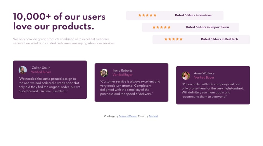
Feedback on the positioning would be greatly appreciated.
Community feedback
- @brodiewebdtPosted almost 3 years ago
What is the problem with the positioning? This looks good. You did a nice job with this. If you change the attribution div to a footer it will clear your accessibility warning.
Marked as helpful0 - @brodiewebdtPosted almost 3 years ago
I wouldn't say miles ahead. The majority of this I have learned in the past few months on Scrimba, Frontend Mentor, The Odin Project, FreecodeCamp and MDN. I don't use Slack very much at all. I spend my time coding or on Scrimba's Discord server. If you want help, just reply to one of these posts and I will get an email. I will follow you as well. Glad I could help.
0 - @brodiewebdtPosted almost 3 years ago
Your welcome.
0@DarhnielPosted almost 3 years ago@brodiewebdt You are miles ahead of me on the learning path. Hope you wouldn't mind me chatting you up personally for some little help? If you wouldn't, you can just drop your slack username and I will gladly chat you up.
0
Please log in to post a comment
Log in with GitHubJoin our Discord community
Join thousands of Frontend Mentor community members taking the challenges, sharing resources, helping each other, and chatting about all things front-end!
Join our Discord