Frontend Mentor | Social links profile HTML , CSS
Design comparison
Community feedback
- @VangmanawKairungPosted 7 days ago
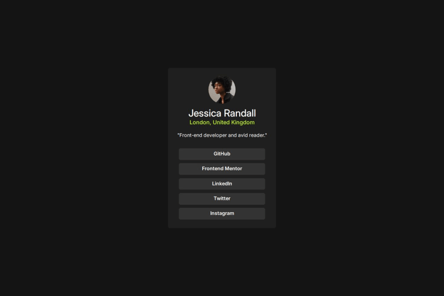
I would suggest replacing non-semantic <div> elements with more meaningful tags, such as using <header> for the card's header section and <nav> for the social links to better convey the structure of the content.
For accessibility improvements, adding aria-labels to the links in the card-links section would help screen readers understand their purpose, and providing more descriptive alt text for the avatar image would enhance usability for visually impaired users.
Structurally, wrapping the entire card in a <section> element with a clear aria-labelledby referencing the name or title would improve the hierarchy and ensure better support for assistive technologies.
Thank for sharing!
0
Please log in to post a comment
Log in with GitHubJoin our Discord community
Join thousands of Frontend Mentor community members taking the challenges, sharing resources, helping each other, and chatting about all things front-end!
Join our Discord
