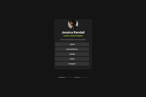
Frontend Mentor | Social Links Profile

Solution retrospective
I am most proud of how I effectively implemented the design and functionality of the profile card, ensuring that it accurately reflects the project requirements and user experience goals. The integration of custom fonts and the attention to responsive design were key highlights that contributed to the overall success of the project.
For future projects, I would focus on optimizing the CSS to enhance cross-browser compatibility and improve load times. Additionally, incorporating more interactive elements could further engage users and provide a richer experience. By setting up a more structured workflow and thorough testing process, I aim to address these areas proactively and refine the development process for even better outcomes.
What challenges did you encounter, and how did you overcome them?One of the main challenges I encountered was ensuring consistent styling and layout across different devices and screen sizes. Achieving proper alignment and centering of elements, especially with custom fonts and varying content lengths, required careful adjustments and extensive testing.
To overcome these issues, I used a combination of flexbox for layout and media queries for responsive design. I also conducted thorough testing on multiple devices to identify and fix inconsistencies. By iterating on the design and applying targeted CSS adjustments, I was able to ensure a cohesive appearance and functionality across various screen sizes and resolutions.
What specific areas of your project would you like help with?I would like help with ensuring that the custom font is applied correctly throughout the project and displays consistently across different devices and browsers. Specifically, I'm looking for feedback on the font's application to ensure it's properly linked and rendered for all text elements. Additionally, I'd appreciate insights into cross-browser compatibility to make sure the font displays well across different browsers. Lastly, I need guidance on how the font scales with the content to maintain a responsive design across various screen sizes. Any feedback on these aspects would be valuable for improving the overall consistency and appearance of my project.
Please log in to post a comment
Log in with GitHubCommunity feedback
No feedback yet. Be the first to give feedback on AHAMED NAJAH's solution.
Join our Discord community
Join thousands of Frontend Mentor community members taking the challenges, sharing resources, helping each other, and chatting about all things front-end!
Join our Discord