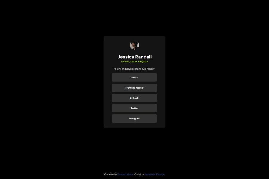
Design comparison
Solution retrospective
It took 45 minutes
What challenges did you encounter, and how did you overcome them?Adjusting the fonts size
What specific areas of your project would you like help with?i am not sure the font sizes are right
Community feedback
- @akmalov11cPosted 11 months ago
Great job on the card component!
Now, let's dive into some feedback to further enhance your work.
HTML:
- Your HTML structure is clear and easy to follow. It could be improved slightly by using more semantic elements like <article> and <ul>.
Responsive Layout:
- Your card layout adapts well to smaller screens. Consider adding media queries for larger screens to maintain consistency.
Adherence to Design:
- Your solution closely matches the design provided.
- For the ".s-m" class, consider increasing the border-radius to create a smoother and more visually appealing button-like appearance.
- In general, paying attention to padding throughout your design can greatly enhance the overall spacing and readability. Consider adjusting padding values to create more balanced and visually pleasing layouts.
Overall, your solution demonstrates a solid understanding of HTML and CSS, with attention to detail and usability. Keep up the good work, and continue refining your skills to create even more polished and accessible designs. Happy coding!
Marked as helpful1@Mennatalla-KhoughaPosted 11 months agoThank you for the great feedback@akmalov11c. I will definitely look out for these points to improve it in future projects
0
Please log in to post a comment
Log in with GitHubJoin our Discord community
Join thousands of Frontend Mentor community members taking the challenges, sharing resources, helping each other, and chatting about all things front-end!
Join our Discord
