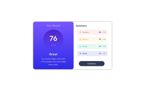
Frontend Mentor - Results summary component
Design comparison
Solution retrospective
عيدكم مبارك ♥
Community feedback
- @skopelosbillPosted over 1 year ago
Hi Hamza, This is a good effort, well done. I would be interested to know where you got
height: 470px;
from - the height was the most difficult part of this challenge for me and I haven't yet worked it out properly.Your design, however, is not responsive, it remains side by side on mobile phones as it is on larger screens. This is my code for the container for the vertical mobile version:
.grid-container { margin: auto; width: min(75%, 46.875rem); display: grid; grid-auto-flow: row; gap: 0; box-shadow: 0 0 0 0; border-radius: 2rem; align-content: center; justify-content: center; }
and this is the code for my horizontally aligned containers on bigger screens:
@media (min-width: 46.875rem) { .grid-container { width: 750px; height: 67%; grid-auto-flow: column; box-shadow: 40px 30px 30px var(--clr-text-pblue); border-radius: 2rem; align-content: center; position: absolute; top: 50%; left: 50%; -ms-transform: translate(-50%, -50%); transform: translate(-50%, -50%); }
Note the
grid-auto-flow: row;
in the mobile version andgrid-auto-flow: column;
in the media query which enables the horizontal version on screens wider than 46.875rem. These are the lines make your design responsive. Of course, there are other considerations and I am not claiming any expertise but I do hope that this feedback helps you a little.Best wishes,
Skopelosbill
Marked as helpful0
Please log in to post a comment
Log in with GitHubJoin our Discord community
Join thousands of Frontend Mentor community members taking the challenges, sharing resources, helping each other, and chatting about all things front-end!
Join our Discord