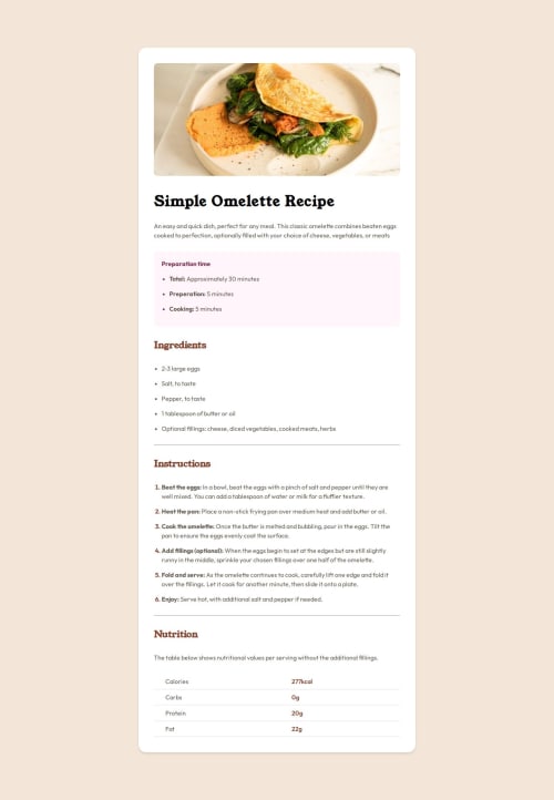
Frontend Mentor Reipe Page Challenge

Solution retrospective
I figured out how to use the CSS clamp function. While I still don't understand how the preferred unit or middle-value works using viewport width properly, I got the desired result with what I tried.
What challenges did you encounter, and how did you overcome them?I had trouble removing the padding for the mobile version of the project. I had an idea of what to do but couldn't figure out the implementation. At the end of the day, ChatGPT helped.
What specific areas of your project would you like help with?I'd appreciate it if anyone could explain the clamp function to me as if I'm a child. It is simple, yet I find messing with the middle value challenging.
Please log in to post a comment
Log in with GitHubCommunity feedback
No feedback yet. Be the first to give feedback on adewalemudasiru's solution.
Join our Discord community
Join thousands of Frontend Mentor community members taking the challenges, sharing resources, helping each other, and chatting about all things front-end!
Join our Discord