Design comparison
SolutionDesign
Community feedback
- P@AliceeLePosted 11 months ago
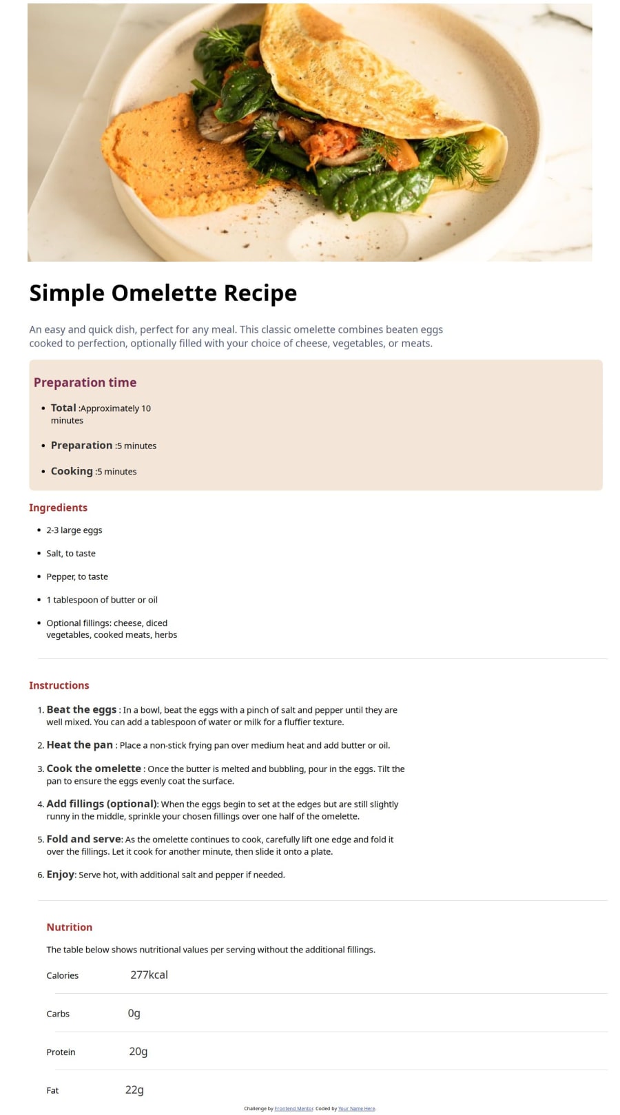
The menu should only be a white box against the pink background so I suggest you can create a div for the menu, then adjusting the size against the background. Furthermore, you can adhere to the fonts by installing fonts on Google and look at the sizes.
0
Please log in to post a comment
Log in with GitHubJoin our Discord community
Join thousands of Frontend Mentor community members taking the challenges, sharing resources, helping each other, and chatting about all things front-end!
Join our Discord
