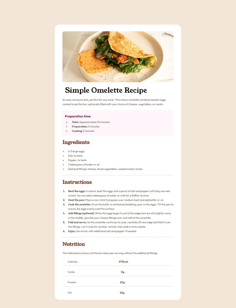
Design comparison
Solution retrospective
i had to get creative with the line breaks at the bottom :))))))))))))
What challenges did you encounter, and how did you overcome them?them line breaks son
What specific areas of your project would you like help with?estimating size (i dont got the figma things) how to center my main container easy
Community feedback
- @StroudyPosted 2 months ago
Amazing job with this! You’re making fantastic progress. Here are some small tweaks that might take your solution to the next level…
-
It is not best practice to use
padding
to move elements around that is a job formargin
on your body. -
This does not matter that much at this stage but something to be mindful of for SEO(Search Engine Optimisation),
<meta>
description tag missing that helps search engine determine what the page is about, Something like this<meta name="description" content="" />
-
Using
max-width: 100%
ormin-width: 100%
is more responsive than justwidth: 100%
because they allow elements to adjust better to different screen sizes. To learn more, check out this article: responsive-meaning. -
Developers should avoid using pixels (
px
) because they are a fixed size and don't scale well on different devices. Instead, userem
orem
, which are relative units that adjust based on user settings, making your design more flexible, responsive, and accessible. For more information check out this, Why font-size must NEVER be in pixels or this video by Kevin Powell CSS em and rem explained.- Another great resource for px to rem converter. -
Using a naming convention like BEM (Block, Element, Modifier) is beneficial because it makes your CSS more organized, readable, and easier to maintain. BEM helps you clearly understand the purpose of each class, avoid naming conflicts, and create reusable components, leading to a more scalable codebase. For more details BEM,
You’re doing fantastic! I hope these tips help you as you continue your coding journey. Stay curious and keep experimenting—every challenge is an opportunity to learn. Have fun, and keep coding with confidence! 🌟
Marked as helpful0 -
- @florinmarescuPosted 2 months ago
its a shame i cant tell what size the padding top is for my main container so the screenshot doesnt align. i dont care about best practices or whatever gobbly gook bs you copy pasted there. it only needs to looks exactly the same as the image and anything else doesnt matter
0@StroudyPosted 2 months ago@florinmarescu, I believe the information I shared is still relevant, and I wanted to provide it to support you. I encourage you to maintain a positive and open mindset, as it will serve you well in the long run. Wishing you all the best in your journey ahead!
Marked as helpful0@florinmarescuPosted 2 months ago@Stroudy if you want to help. tell me how to figure out the positioning of the main container so the two screenshots align, its a real shame i cant look at them both side to side see how i actually did. the rest is not relevant. its just practice, no need for meta and seo and all that in beginner html and css projects that go nowhere.
0@StroudyPosted 2 months ago@florinmarescu, You can try to remove this from your body,
padding-bottom: 50px
padding-top: 150px;
and your otherpadding-top: 50px;
replace it with thismargin: 8rem 0 8rem 0;
Then I would remove this from your main,
margin: auto;
and replace it with thismargin-inline: auto;
Explanations:
-
The shorthand
margin: 8rem 0 8rem 0;
sets 8rem top and bottom margins, and 0 left and right margins. -
margin-inline: auto;
centers an element horizontally only, respecting the text direction (left-to-right or right-to-left).
I would not have shared that information with you if it wasn't applicable, Please consider the feedback for your next project.
Marked as helpful0@florinmarescuPosted 2 months ago@Stroudy this was cool
The shorthand margin: 8rem 0 8rem 0; sets 8rem top and bottom margins, and 0 left and right margins.
margin-inline: auto; centers an element horizontally only, respecting the text direction (left-to-right or right-to-left).
0@StroudyPosted 2 months ago@florinmarescu, I forgot to mention you can make it even shorter,
margin: 8rem auto;
does the exact same thing. This short-hand also applies toborder
,padding
,margin
,border-radius
and anything else with 4 values, Top right bottom left.
Marked as helpful0
Please log in to post a comment
Log in with GitHubJoin our Discord community
Join thousands of Frontend Mentor community members taking the challenges, sharing resources, helping each other, and chatting about all things front-end!
Join our Discord