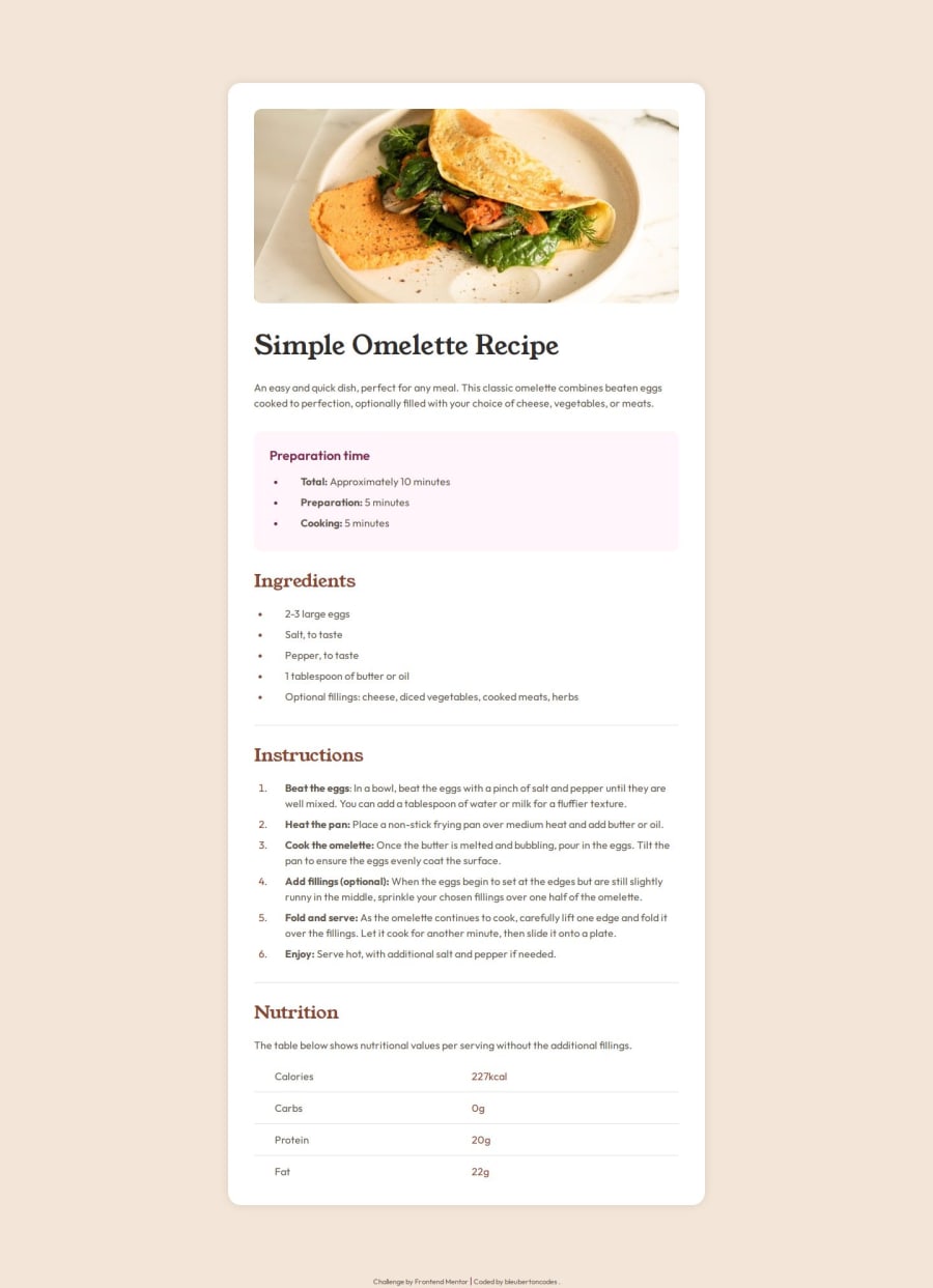
Design comparison
Solution retrospective
I am very proud of completing this project fully. I am most proud of problem solving to get the results that I wanted, for example, aligning the footer of my page to stay at the very bottom was a bit challenging, but I tried a lot of different techniques until one of them worked. What I would do differently next time is to take the time upfront to start off the project more organized so it is easier for me to follow when making edits and revisions.
What challenges did you encounter, and how did you overcome them?The biggest challenge I encountered was how to get the table portion to look like the design. First I used an actual table element and quickly realized that it would be much easier to create my own "table" using multiple div elements instead. I overcame this obstacle by experimenting with the various ways I could achieve the table from the design and ultimately coming to the solution described above.
What specific areas of your project would you like help with?Areas that I would like help with in this project are better ways to organize my CSS and ways to improve accessibility within my HTML. Any constructive feedback is very much appreciated.
Community feedback
- P@kaamiikPosted 2 months ago
Some notes which may improve your code:
- You do not need to have two
imgelements for the top Omelette for mobile and desktop views. First, structure your HTML based on the desktop layout. Then, use CSS to style the image for mobile views, and apply media queries to adjust the styling for desktop views.
- Instead of using
<div class="divider"></div>, try using the<hr>tag, which is more semantic.
- All the headings should be
h2because they are in the same hierarchy.
- For the nutrition section, use a
<table>element in HTML. Remember, this challenge is for practicing using semantic tags as best as you can.
- You do not need any CSS properties inside HTML elements, and there is no need to have
position: relativehere.
- You only need
min-widthfor media queries and do not need to usemax-width.
0 - You do not need to have two
- @JamalGuyoPosted 2 months ago
Congratulations on finishing the challenge. Everything looks good on larger screens but breaks at smaller screens. Check the responsiveness on 320px. I would suggest doing a mobile-first design and scale to the larger screen sizes.
0@bleubertoncodesPosted 2 months ago@JamalGuyo Thank you so much for taking a look at my solution. When you say it breaks what exactly do you mean? I load it on my phone and it looks like the designs.
0@JamalGuyoPosted 2 months ago@bleubertoncodes I inspected using the device toolbar on google chrome on 320px. It's not responsive on that width.
0@bleubertoncodesPosted 2 months ago@JamalGuyo Okay! Thanks so much, I will go back and fix it for smaller sizes
1
Please log in to post a comment
Log in with GitHubJoin our Discord community
Join thousands of Frontend Mentor community members taking the challenges, sharing resources, helping each other, and chatting about all things front-end!
Join our Discord
