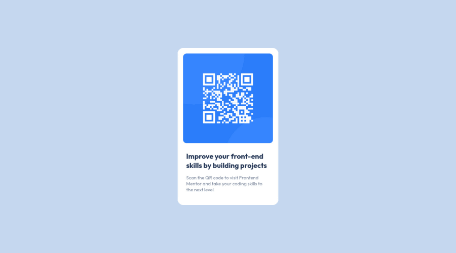
Design comparison
SolutionDesign
Solution retrospective
- It was very difficult for me to learn everything from scratch, I have little knowledge in the area
- in the background colors css 3.yessir
Community feedback
- @0xabdulkhaliqPosted about 2 years ago
Hello there 👋. Congratulations on successfully completing the challenge! 🎉
- I have other recommendations regarding your code that I believe will be of great interest to you.
HTML 🏷️:
- This solution generates accessibility error reports, "All page content should be contained by landmarks" is due to
non-semanticmarkup, which causes lacking of landmark for a webpage
- So fix it by replacing the
<div class="container">element with the semantic element<main>in yourindex.htmlfile to improve accessibility and organization of your page.
- What is meant by landmark ?, They used to define major sections of your page instead of relying on generic elements like
<div>or<span>. They are use to provide a more precise detail of the structure of our webpage to the browser or screen readers
- For example:
- The
<main>element should include all content directly related to the page's main idea, so there should only be one per page - The
<footer>typically contains information about the author of the section, copyright data or links to related documents.
- The
HEADINGS ⚠️:
- This solution has also generated accessibility error report due to lack of level-one heading
<h1>
- Every site must want at least one
h1element identifying and describing the main content of the page.
- An
h1heading provides an important navigation point for users of assistive technologies, allowing them to easily find the main content of the page.
- So we want to add a level-one heading to improve accessibility by reading aloud the heading by screen readers, you can achieve this by adding a
sr-onlyclass to hide it from visual users (it will be useful for visually impaired users)
TEXT ALIGNMENT 📐:
- Looks like the text inside the component has been not centered as per the design, If you want to boost your solution's preview you can try out the following single line css rule.
.text {
   text-align: center;
}
- Now you solution's preview will 99% match the design comparison. If you want the 1% then update the
background-color: #D6E1F0forbodyelement.
.
I hope you find this helpful 😄 Above all, the solution you submitted is great !
Happy coding!
0 - @sumanth-chandanaPosted about 2 years ago
Hi mate!, congrats🎉 on completing the challenge. Better take care about following points.
- Always check Frontend mentor Report Generator issues after submitting the project for removing errors and warnings.
- Maintain your
<h1>and<p>tag elements totext-align: center;and it will match the same design. - Also, Check your
background-color. - To avoid accessibility issues "All page content should be contained by landmarks" use code as :
 <body>
    <main>
        ---your code here----
    </main>
  <footer>
  </footer>
</body>
(why does
<main>matter? Read here )- For proper centering the container(whole card) vertically and horizontally you can also use the following simple block of code use code:
body{
    display: flex;
    align-items: center;
    justify-content: center;
    height: 100%;
}
or
body { min-height: 100vh; display: grid; place-content: center; }
- When we open the GitHub repository link, you will find an About Section on the right side. There, also include a live preview link of your project. It is better for someone to check your live project while interacting with code.

**I hope you will find this Feedback Helpful.**
0
Please log in to post a comment
Log in with GitHubJoin our Discord community
Join thousands of Frontend Mentor community members taking the challenges, sharing resources, helping each other, and chatting about all things front-end!
Join our Discord
