Frontend Mentor - QR code component solution using Flexbox and Grid
Design comparison
Solution retrospective
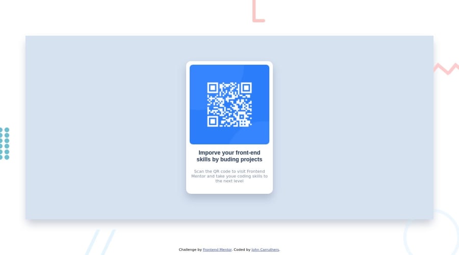
The colours provided for the project seemed wrong compared with the preview. I manage to create the Desktop Preview using Flexbox. The main element of the design are built from nested divs.
I created the individual background pattern elements using divs, lis and CCS Pseudo elements. (not exact but ok..ish)
Didn't complete the mobile version but will add a media query later.
My CSS could do with little tidying... Enjoyed the challenge. https://codetinker.co.uk You can view my efforts here.
Community feedback
- @MelvinAguilarPosted 11 months ago
Hello there π. Good job on completing the challenge !
I have some suggestions about your code that might interest you.
Background π:
-
You should not recreate the background, you used the image
desktop-preview.jpg
to create your solution, but that image is for decoration and is a nice way to present the challenge, for example, you can use it in your github README.You must use the images
desktop-design.jpg
andmobile-design.jpg
to create your solution.
HTML π·οΈ:
- Use semantic elements such as
<main>
and<footer>
to improve accessibility and organization of your page.
- You should not use inline-CSS because it is not a good practice. Instead, you should use an external stylesheet to style your page. By doing this, you will be able to have a better organization of your code and will be able to understand it better.
CSS π¨:
- Instead of using pixels in font-size, use relative units like
em
orrem
. The font-size in absolute units like pixels does not scale with the user's browser settings. Resource π.
- Use
min-height: 100vh
instead ofheight
. Setting the height to 100vh may result in the component being cut off on smaller screens, such as a mobile phone in landscape orientation.
I hope you find it useful! π Above all, the solution you submitted is great!
Happy coding!
Marked as helpful1@techyjcPosted 11 months ago@MelvinAguilar Thank you, Melvin. I have been messing about with HTML & CSS since the mid 90's. I really enjoy exploring the CSS capabilities. I realised about the background after I finished. Although re-creating the design elements was an interesting test in itself. I didn't use semantic elements as I was just testing my own knowledge of CSS. I have used Semantic elements when designing proper pages (Although more for fun and not work.).
Thanks again.
0 -
- @techyjcPosted 11 months ago
Not sure I was supposed to recreate the background patterns... (Now commenting on my own work)...
0
Please log in to post a comment
Log in with GitHubJoin our Discord community
Join thousands of Frontend Mentor community members taking the challenges, sharing resources, helping each other, and chatting about all things front-end!
Join our Discord