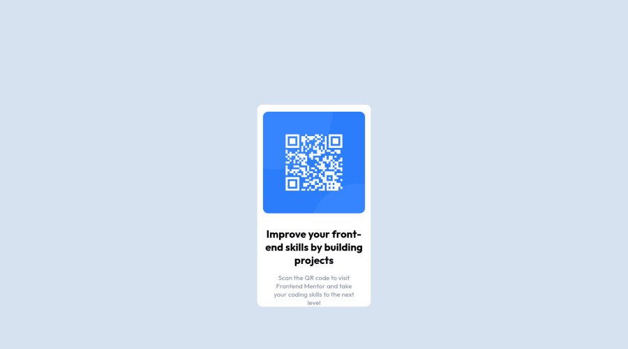
Design comparison
Solution retrospective
Hi, I have been practicing html/css/js since early 2021. Recently though, i have been adding to my skills by learning backend tech. So, i was surprised how long this challenge took me (on and off for about 3 hours). I guess it shows if you don't practice you get rusty. If anyone has any feedback on tips or tricks to help with responsive design- ideally i would like the qr card to gradually reduce in size as opposed to snapping to a particular size which can create a jarring effect as the screen-size is achieved set by the media query. I suppose you could set multiple media query ranges- this is the only way i am aware of. Any suggestions welcome. Thanks
Community feedback
- @MatzeW95Posted almost 3 years ago
Hi I personally would try to set as less stuff as possible in your "main". After that you can use the section for just like a structure thing.(personally wouldn't set to much stuff in there as well) But inside the the "section" I would put a "div" that i would style. (This makes it easier to change stuff for your responsibility, because you have to only change it at one place) That "div" would only need something like "border-radius, background-color, width, margin: 5rem auto"
It's kinda hard to tell you that stuff in text if you want you can have a look at my solution: https://www.frontendmentor.io/challenges/qr-code-component-iux_sIO_H/hub/qr-code-component-cHniroyj2
0@wkan17012021Posted almost 3 years ago@MatzeW95 Thanks Matthias I'm definitely trying to be as minimalistic as possible. I noticed in your code you didn't use absolute positioning, rather set the outer container top/right& left/ bottom margins to sit generally in the middle of the screen. That seems to be a simpler solution. Thanks for the feedback.
0
Please log in to post a comment
Log in with GitHubJoin our Discord community
Join thousands of Frontend Mentor community members taking the challenges, sharing resources, helping each other, and chatting about all things front-end!
Join our Discord
