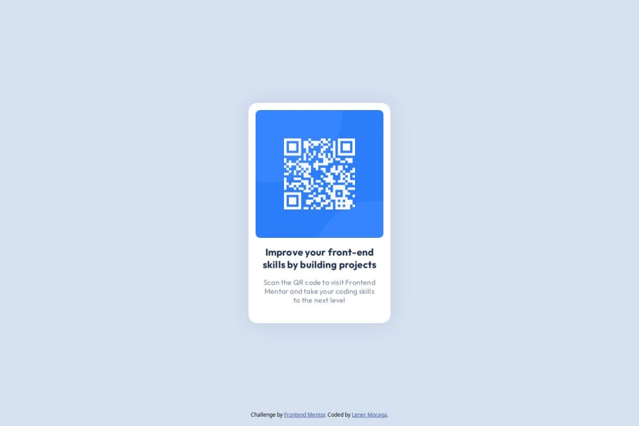
Design comparison
Solution retrospective
I am proud that the design and the result are quite similar.
What challenges did you encounter, and how did you overcome them?I found it somewhat difficult to center the elements. In some initial screenshots, my proposal came out shifted upwards, I had to use a reset.css and then adjust the css, to make my solution resemble the desired design.
What specific areas of your project would you like help with?I understand that not everything can be pixel perfect on the frontend, but I notice that the fonts are a bit high or don't look identical enough to the design. I would like to know if there is a tool or way to know how to improve that part.
Community feedback
- @correlucasPosted about 2 years ago
๐พHi Lenz Moraga, congratulations on your solution!๐ Welcome to the Frontend Mentor Coding Community!
Great solution and a great start! From what I saw youโre on the right track. Iโve few suggestions for you that you can consider adding to your code:
1.Add
<main>
instead of<div>
to wrap the card container. This way you show that this is the main block of content and also replace the div with a semantic tag.2.Use relative units as
rem
orem
instead ofpx
to improve your performance by resizing fonts between different screens and devices. These units are better to make your website more accessible. REM does not just apply to font size, but to all sizes as well.3.Add a margin of around
margin: 20px
to avoid the card touching the screen edges while it scales down.4.Something that can be a time saver for you is to use a CSS RESET to remove all default settings for margins, making the images easier to work, see the article below where you can copy and paste this CSS code cheatsheet: https://piccalil.li/blog/a-modern-css-reset/
Here's my solution for this challenge if you wants to see how I build it: https://www.frontendmentor.io/solutions/qr-code-component-vanilla-cs-js-darklight-mode-nS2aOYYsJR
โ๏ธ I hope this helps you and happy coding!
Marked as helpful1@lenz-moragaPosted about 2 years agoHi @correlucas, thanks for the comments, I'll work on them to improve the way I create the HTML structure, also because I'm looking forward to improving my ADA compliance knowledge with the semantic tags and aria attributes.
0
Please log in to post a comment
Log in with GitHubJoin our Discord community
Join thousands of Frontend Mentor community members taking the challenges, sharing resources, helping each other, and chatting about all things front-end!
Join our Discord