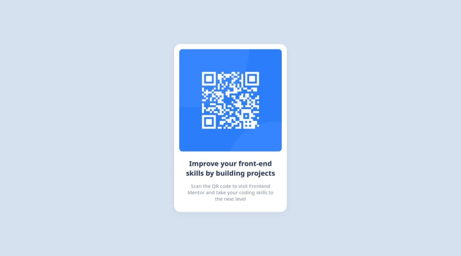
Design comparison
Solution retrospective
I quickly pulled out the design, but next time I'll examine the figma content in more detail.
What challenges did you encounter, and how did you overcome them?I had a hard time finding the font family value in Figma, but I learned how to find it by doing some research.
What specific areas of your project would you like help with?There is no place I can ask for help.
Community feedback
- @danielmrz-devPosted 8 months ago
Hey @AysenAlpsln!
Your solution is really impressive!
I've got a couple of ideas (about how to use HTML better) that could make it even stronger:
๐ First: Think about using
<main>
to wrap your main content instead of<div>
.Imagine
<div>
and<span>
in HTML as basic containers. They're good for holding stuff, but they don't tell us much about what's inside or its purpose on the webpage.๐ Second: Consider employing
<h1>
to<h6>
tags for headings rather than using<span>
.When it comes to headings, HTML offers us a range of heading tags: from
<h1>
to<h6>
.Here's a quick guide on how to use them:
- The
<h1>
to<h6>
tags are used to define HTML headings. <h1>
is for the most important heading.<h6>
is for the least important heading.- Stick to just one
<h1>
per page โ it should be the main title for the whole page. - And don't skip heading levels โ start with
<h1>
, then use<h2>
, and so on.
It's more than just text size โ it's about structuring your content effectively.
These tweaks might not change how your page looks, but they'll make your HTML code clearer and help with SEO and accessibility.
Hope that's helpful!
Keep up the great work!
0 - The
- @RobertLikesCodingPosted 8 months ago
Hey there Aysen!
Great job! This is very close to the original ๐ I read you were struggling finding the right font-family. Have another look in the project folder. There is a style-guide in there that gives you the font-family.
Another small improvement you could keep in mind for the next challenge is more semantic HTML tags. Instead of the
span
tags rather useh1
andp
and maybe evenmain
for the main div. It seems irrelevant for tiny challenges like this but I think it's good practice to do it even for small projects :)Hope this helped!
0
Please log in to post a comment
Log in with GitHubJoin our Discord community
Join thousands of Frontend Mentor community members taking the challenges, sharing resources, helping each other, and chatting about all things front-end!
Join our Discord