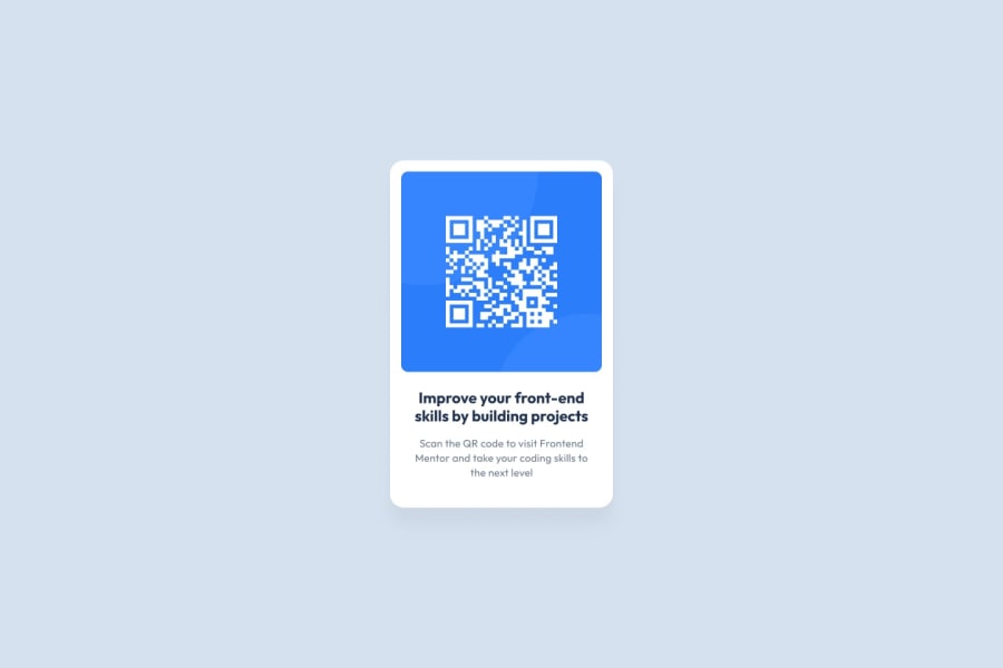
Design comparison
Community feedback
- @Islandstone89Posted 4 months ago
Hi there - good job!
A few tips:
HTML:
-
In most cases, it's recommended to use classes instead of IDs.
-
I would remove "illustration" from the alt text - screen readers announce images as "image" by default. The alt text must also say where it leads(the frontendmentor website). A good alt text would be "QR code leading to the Frontend Mentor website."
-
.attributionshould be a<footer>, which needs to be outside of the<main>.
CSS:
-
Including a CSS Reset at the top is good practice.
-
I like to add
1remofpaddingon thebody, to ensure the card doesn't touch the edges on small screens. -
I would move the properties on
mainto thebody, and also addgap: 2remto create space between the main and the footer. -
The
max-widthon the card looks good, but it should be in rem, so change it to20rem, which equals320px. -
font-sizemust never be in px. This is a big accessibility issue, as it prevents the font size from scaling with the user's default setting in the browser. Use rem instead. -
On the image, remove the
max-widthandmax-heightinpx.adddisplay: blockandmax-width: 100%- the max-width prevents it from overflowing its container. -
The card should have equal padding on all sides, so change
padding: 1rem 0topadding: 1rem. -
I would remove
position: fixedon the footer.
Marked as helpful0 -
Please log in to post a comment
Log in with GitHubJoin our Discord community
Join thousands of Frontend Mentor community members taking the challenges, sharing resources, helping each other, and chatting about all things front-end!
Join our Discord
