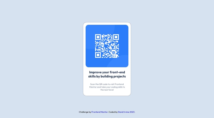
Design comparison
Solution retrospective
This is my first Frontend Mentor submission. I had a lot of fun doing this challenge.
See you all with the next one :)
All feedback welcome!
happy coding! :)
Community feedback
- @HassiaiPosted over 1 year ago
Replace <div class="card-container"> with the main tag, <h3> with <h1> and <div class="footer"> with the footer tag to make the content/page on the accessible. click here for more on web-accessibility and semantic html
Give the alt attribute in the img a value. The value of the alt attribute is the description of the image. For decorative images like icons, there is no need to give it an alt value, for more on alt attribute Click here.
Every html must have <h1> to make it accessible. Always begin the heading of the html with <h1> tag wrap the sub-heading of <h1> in <h2> tag, wrap the sub-heading of <h2> in <h3> this continues until <h6>, never skip a level of a heading.
There is no need to give the body a width.
Give h1 and p text-align: center, the same margin-left, margin-right and margin-top values. Give p a margin bottom value.
For a responsive content,
- Replace the width in .card-container with max-width and there is no need to give it a height value.
max-width: 320px which is 20rem/em - Give the img a max-width of 100% and a border-radius value, the rest are not needed.
Use relative units like rem or em as unit for the padding, margin, width values and preferably rem for the font-size values, instead of using px which is an absolute unit. For more on CSS units Click here
Hope am helpful.
Well done for completing this challenge. HAPPY CODING
0 - Replace the width in .card-container with max-width and there is no need to give it a height value.
- @josh76543210Posted over 1 year ago
Hi @DavidIrvine-TW,
Great job on your solution! Looks Good!
I do have one recommendation:
Change the
height: 100vh;tomin-height: 100vh;for the body. This will prevent your content from being cut off when the view-port is smaller than your content.Bonus tip: Add
margin-bottom: 50px;to the card-container to also account for your footer and prevent it from overlapping the other content.Happy Coding!
0
Please log in to post a comment
Log in with GitHubJoin our Discord community
Join thousands of Frontend Mentor community members taking the challenges, sharing resources, helping each other, and chatting about all things front-end!
Join our Discord
