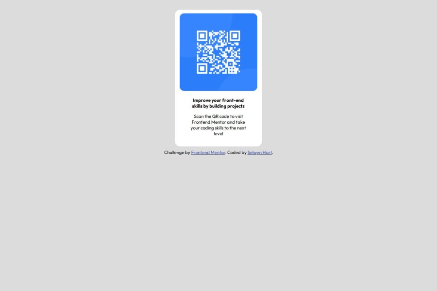
Design comparison
Solution retrospective
I'm proud of the fact that I could go through this challenge and build this project despite the fact that I haven't worked on any projects in a while.
I will be using other frameworks like react, vue, angular, etc to enhance my knowledge of new technologies differently in the coming projects.
What challenges did you encounter, and how did you overcome them?I had forgotten how to center a div and get border-radius, but with the help of w3schools I was able to overcome these challenges
Community feedback
- @DevHusseinPosted 15 days ago
Please let me know if you have any comments to me! Thanks
0 - @qutubahmed732Posted 15 days ago
To give high-quality, constructive feedback on a solution with these criteria, here’s how you might break down your evaluation:
1. Semantic HTML
- Check if semantic elements like
<header>
,<footer>
,<main>
,<section>
,<nav>
,<article>
, and<aside>
are used properly. These help screen readers and search engines understand the page structure. - Ensure buttons and links are used appropriately. If a button is doing navigation, it should be a link instead, while buttons should be used for actions.
- If there’s a form, make sure the solution uses
<label>
tags associated with each input for accessibility.
2. Accessibility
- Alt attributes should be present and descriptive for all images.
- Make sure color contrasts meet WCAG standards. Tools like Contrast Checker can help verify this.
- Keyboard navigation: Test if all interactive elements are reachable and usable via keyboard, especially for screen reader compatibility.
- ARIA attributes: If the project includes dynamic elements (like modals or carousels), ensure that ARIA attributes are properly used to inform screen readers about these components.
3. Responsive Layout
- Test the layout on a range of screen sizes: small screens (phones), medium screens (tablets), and large screens (desktops).
- Breakpoint consistency: Check if content reflows gracefully without breaking or causing horizontal scroll on different screens.
- Touch target size: Make sure buttons and interactive elements are large enough to be tapped easily on mobile devices.
4. Code Quality
- Look for consistent indentation and clear organization in the HTML, CSS, and JavaScript (or any scripting language used).
- Naming conventions in classes and IDs should be consistent, meaningful, and easy to understand.
- Evaluate if the solution is modular and reusable. For example, CSS classes or JavaScript functions should be created in a way that makes them easy to adapt and reuse.
- Avoid repetition by ensuring that common styles are applied through classes instead of inline or repetitive code blocks.
5. Design Consistency
- Compare the final solution to the original design mockup to ensure visual fidelity. Look at elements like spacing, alignment, typography, and color use.
- Font choices and sizes should match the design, and there should be consistency in styling across similar components.
- Ensure attention to detail, especially with elements like hover effects, active states, and focus states, which add polish to the design.
Additional Tips
- Encourage continuous improvement by mentioning any areas where best practices or alternative approaches could benefit the solution.
- Provide positive reinforcement for areas done well. Highlighting strengths can be just as helpful as constructive criticism.
Using this framework to provide feedback will help guide the developer toward creating a polished, accessible, and maintainable solution.
0 - Check if semantic elements like
Please log in to post a comment
Log in with GitHubJoin our Discord community
Join thousands of Frontend Mentor community members taking the challenges, sharing resources, helping each other, and chatting about all things front-end!
Join our Discord