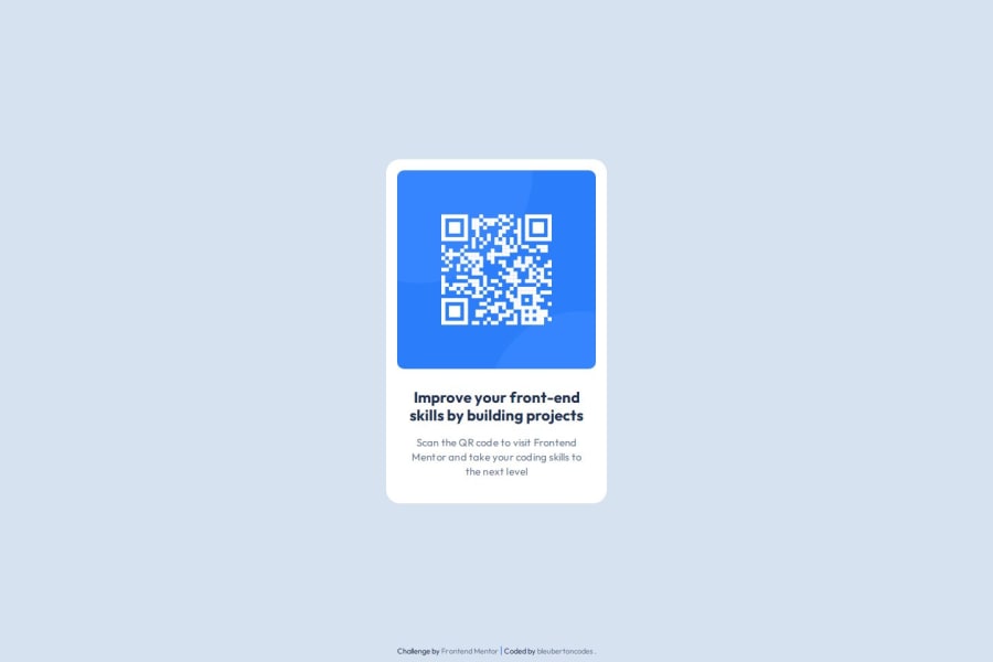
Design comparison
Solution retrospective
As someone who is starting the journey into Web Dev, I am extremely proud of the outcome of this challenge. I a most proud of that I executed the challenge and used github for the first time successfully! Next time I would focus on one section of the challenge at a time (top to bottom) instead of all together.
What challenges did you encounter, and how did you overcome them?The biggest challenge I had was how to push my footer to the bottom while keeping the card component centered. I researched and used MDN for guidance and realized that I could achieve the results I wanted by using margin.
What specific areas of your project would you like help with?This is the first project I have completed aside from my learning and would like some honest feedback about my execution of the challenge (html and CSS) as well as my README.md (first time using one).
Community feedback
Please log in to post a comment
Log in with GitHubJoin our Discord community
Join thousands of Frontend Mentor community members taking the challenges, sharing resources, helping each other, and chatting about all things front-end!
Join our Discord
