Design comparison
Solution retrospective
I would love to get feedback about my code, how should i have code it? What is necessary and what is not necessary.
Community feedback
- @Kamlesh0007Posted over 1 year ago
Hello there 👋. Congratulations on successfully completing the challenge! 🎉
I have other recommendations regarding your code that I believe will be of great interest to you. CSS 🎨:
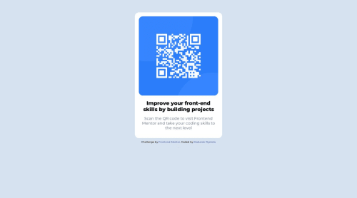
Looks like the component has not been centered properly. So let me explain, How you can easily center the component without using margin or padding. We don't need to use margin and padding to center the component both horizontally & vertically. Because using margin or padding will not dynamical centers our component at all states To properly center the component in the page, you should use Flexbox or Grid layout. You can read more about centering in CSS here 📚. For this demonstration we use css Grid to center the component. body { min-height: 100vh; display: grid; place-items: center; }
Marked as helpful0 - @HassiaiPosted over 1 year ago
Replace <div class="container"> with the main tag and <h3> with <h1> to make the content/page accessible. click here for more on web-accessibility and semantic html
<div class="attribution"> should be out <div class="container"> and wrap in a footer tag.Every html must have <h1> to make it accessible. Always begin the heading of the html with <h1> tag wrap the sub-heading of <h1> in <h2> tag, wrap the sub-heading of <h2> in <h3> this continues until <h6>, never skip a level of a heading.
sample html:
<main><img><div class= "content"><h1></h1><p></p></div></main> <footer> <div class="attribution"> </footer>
To center main on the page using grid, add min-height:100vh; display: grid place-items: center to the body
body{ min-height: 100vh; display: grid; place-items: center; }
Give the body a background-color of light-gray. For a responsive content,
- Give .container a fixed max-width value, a padding value for all the sides
max-width: 320px which is 20rem/em padding:16px which is 1rem/em
, a background-color of white and a border-radius value. - Give the img a max-width of 100% and a border-radius value, the rest are not needed.
Give .content a margin value for all the sides, text-align: center . Give p a margin-top or h1 a margin-bottom value for the space between the text.
Use relative units like rem or em as unit for the padding, margin, width values and preferably rem for the font-size values, instead of using px which is an absolute unit. For more on CSS units Click here and here
Hope am helpful.
Well done for completing this challenge. HAPPY CODING
Marked as helpful0@Mubarak-OyekolaPosted over 1 year ago@Hassiai Thank you very much for the correction, i will make amendment to the code.
Thanks.
0@Mubarak-OyekolaPosted over 1 year ago@Hassiai Please, is there anyway i can contact you? I would love to ask some questions and as well learn somethings about you.
Probably your Whatsapp number or Gmail address. Thank you.
0 - Give .container a fixed max-width value, a padding value for all the sides
- @zsoltvarjuPosted over 1 year ago
Hello Mubarak-Oyekola! :)
Here are my suggestions:
CSS:
- Remove duplicate font-family declarations: You have defined the 'Montserrat' font-family twice in the 'body' selector. You can remove one of them to avoid redundancy.
- Use consistent measurement units: In the 'container img' selector, you have used 'px' units to define the width and height of the image, but you have used '%' units to define the width and height of the container. It's better to use the same units consistently throughout the code.
- Add units to the margin-top property: In the 'body' selector, you have set the margin-top property to 50, but you have not specified the unit of measurement. It's better to add a unit such as 'px' or 'em' to avoid confusion.
- Increase font size in attribution: The font size of 7px in the 'attribution' selector may be too small and difficult to read. Consider increasing it to improve readability.
- Use more meaningful class names: The class names 'container', 'contents', and 'attribution' are not very descriptive and may make the code harder to understand and maintain. Consider using more meaningful names that describe the purpose of each element.
HTML:
- Add alt text to images: You have used an image tag to display the QR code image, which is good. However, it's important to provide an alt text for the image to improve accessibility. The alt text describes the image for users who cannot see the image or who use assistive technologies like screen readers.
- Use semantic HTML: Your code already uses some semantic HTML tags like 'head', 'body', 'div', and 'h3'. To improve the semantic structure of your HTML, you can consider using more descriptive tags like 'header', 'main', 'section', 'footer', etc. for different parts of your web page.
- Add comments: Adding comments to your code can make it easier to understand and maintain. You can add comments to explain the purpose of different sections or elements of your HTML.
Furthermore your container is not centered vertically, i would suggest to do that because your project will look 100% better. You should watch tutorias about Flex and Grid, they make placing items to their corresponding places much much easier. i can suggest you 2 tutorial sites:
- Flexbox - https://flexboxfroggy.com/
- Grid - https://cssgridgarden.com/
Learn about them and then solve these mini-games and it will be much easier to play with positioning!
Once again congratulations to your project, happy coding! :)
Marked as helpful0@Mubarak-OyekolaPosted over 1 year ago@zsoltvarju Thank you, i will make the necessary adjustment as advised by you.
Thank you!
1
Please log in to post a comment
Log in with GitHubJoin our Discord community
Join thousands of Frontend Mentor community members taking the challenges, sharing resources, helping each other, and chatting about all things front-end!
Join our Discord