Submitted over 2 years ago
Frontend Mentor - Product preview card component
#accessibility

@kelvin-0

Design comparison
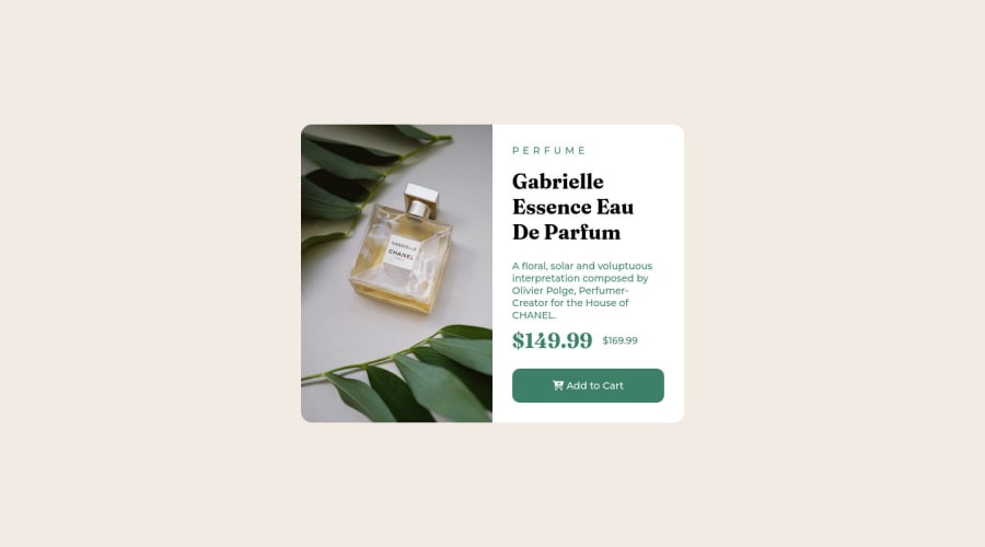
SolutionDesign

Solution retrospective
- I just started implementing relative units of measurement(rem) in my code instead of using px, did I use rem correctly by changing the font size of the HTML element for every screen size change?
- Should I use grid or flex for this challenge?
- Did I write good code using flexbox?
- do I have a good readability website?
- on the mobile version, how can I achieve the same design as the given design? Thank you I am new to web design and sorry for my bad English. Any help would be appreciated.
Community feedback
Please log in to post a comment
Log in with GitHub
Join our Discord community
Join thousands of Frontend Mentor community members taking the challenges, sharing resources, helping each other, and chatting about all things front-end!
Join our Discord